Sleepless

Finally – the fourth of four prints from the 2015 APPAs – Sleepless. This print is by far the most important to me, because it’s very personal for our family.

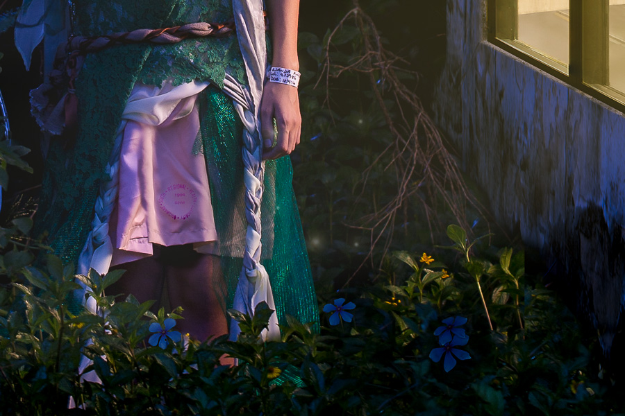
Wanda has struggled with anxiety and depression for many years. The first hints of depression showed up not long after our son was born. From then on, it was a bit of a rollercoaster, until the anxiety thing moved in and set up shop. She’s managing it, but it’s always there, and it seems to sneak out and grab her by the leg at the worst possible time.

One of the times Wanda is most vulnerable to it is at night. During the day, there are sights and noises and people to talk to and things to do… At night, you’re alone in the quiet with your thoughts. Nothing to take your attention, nothing to divert you from thinking about everything that might be happening in life. The way Wanda describes it to me, her brain jumps from thing to thing, all of them urgent and all of them important, and when she tries to get away from one of them another one jumps in her way. So she lies awake for ages, thinking about everything and getting more and more caught up in it. One of her defence mechanisms is her phone; playing Bejeweled or Drop 7 or Zuma or another game like that fills her mind and lulls her back to where she can go to sleep… and eventually she does. Meanwhile, I’m sleeping peacefully next to her. I’m a bit of a super sleeper, I can fall asleep mid-sentence sometimes and I

…sorry, nodded off there. Where was I? Yeah, good sleeper. So I sleep through Wanda’s anxiety attacks when she has them. She knows I can’t do anything about them, so she lets me rest.

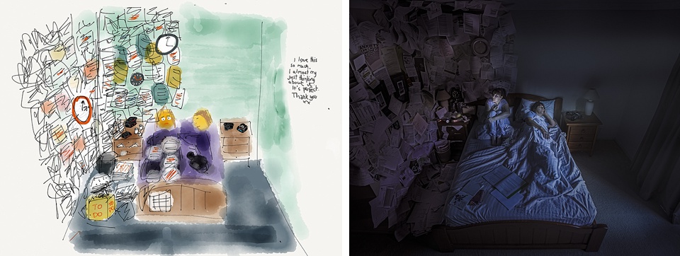
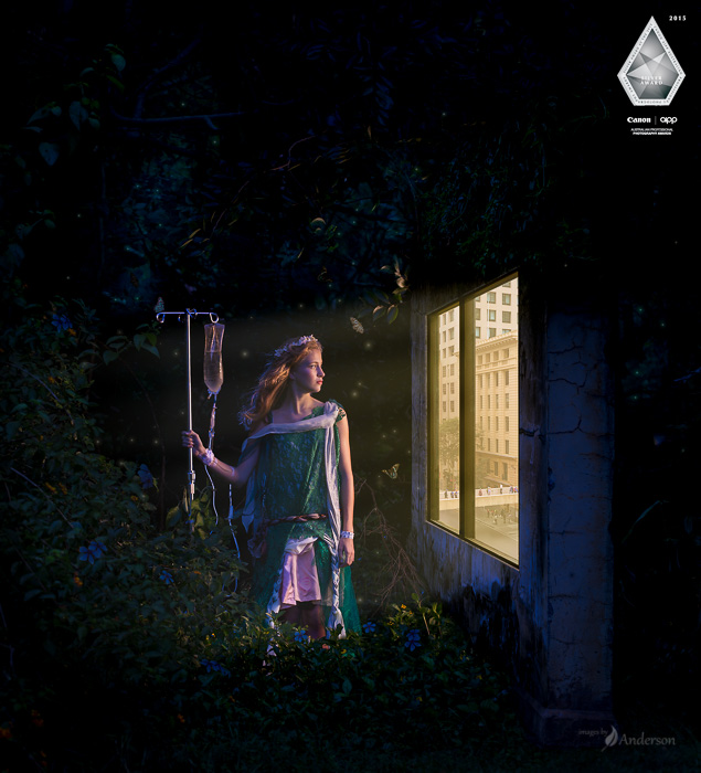
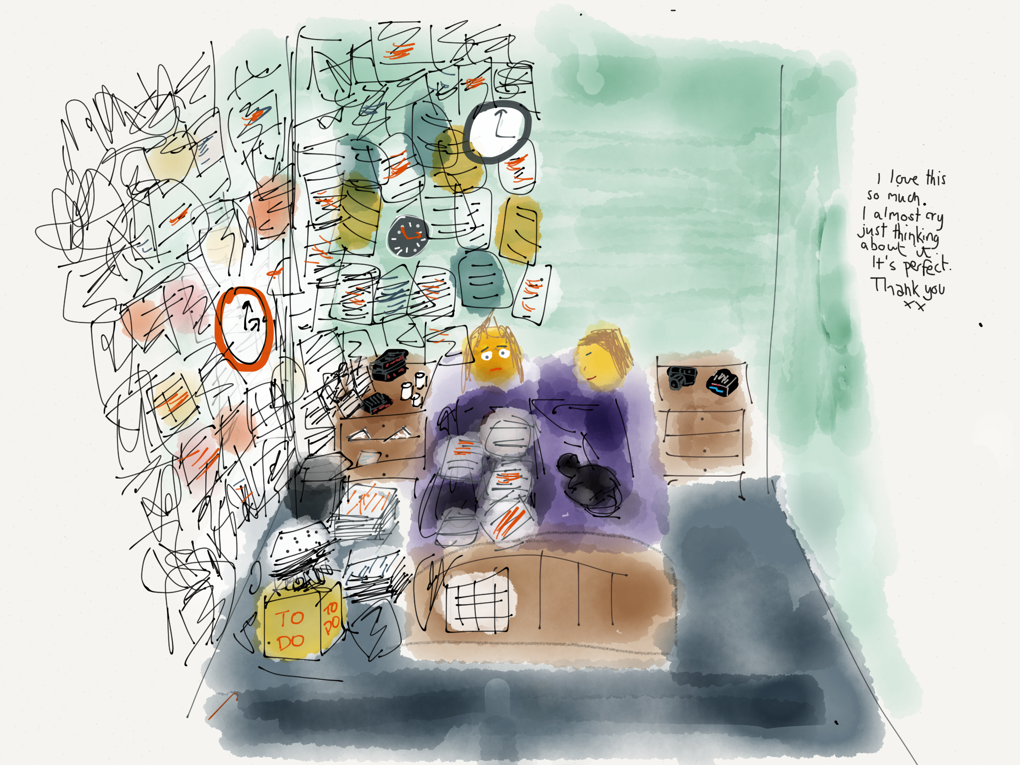
I wanted to put an image together that told this story. I think this was mostly art therapy; trying to communicate a rich visual representation of Wanda’s state of mind seemed like a good idea. I sketched it out, as I often do. Wanda found the sketch on the iPad and left a little note of her own.

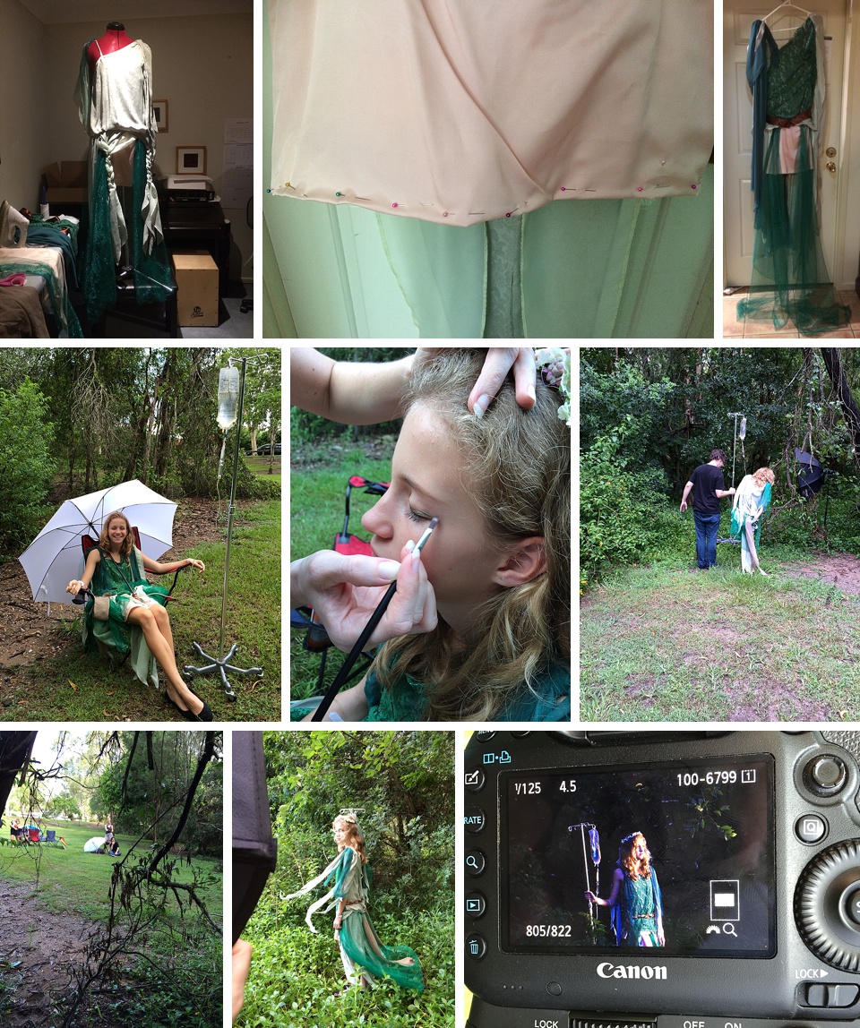
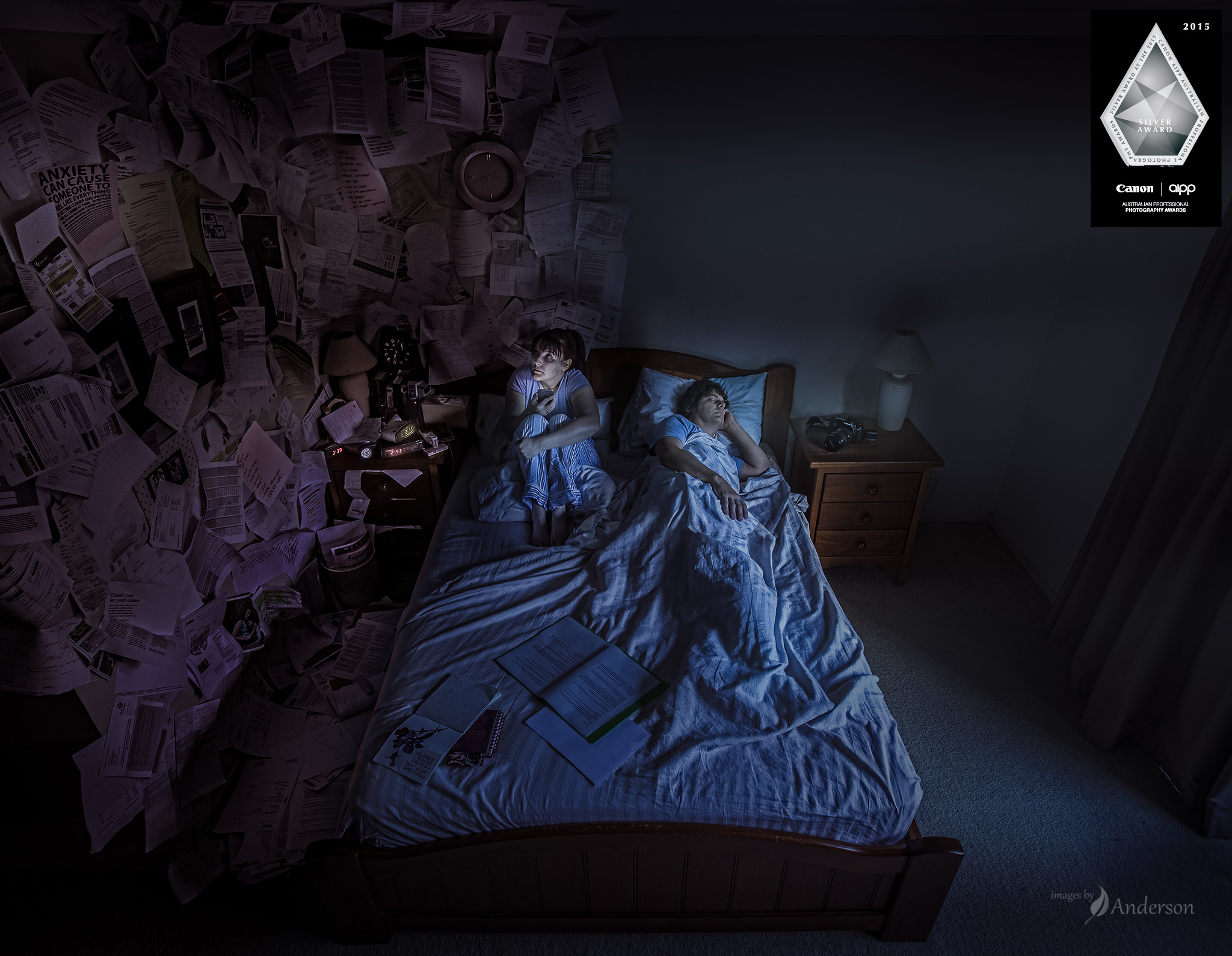
Earlier this year I arrived home (from the Queensland photography conference Hair of the Dog where we talked about art therapy, by coincidence) to find Wanda had decorated our bedroom to match the sketch. She did a pretty masterful job, with pages flowing off of the wall in a chaotic mess. It looked just like the sketch!

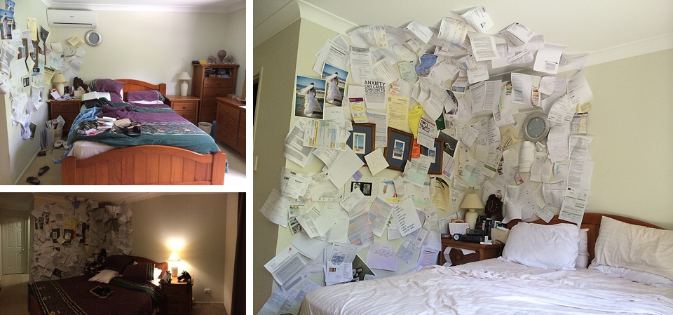
Wanda: “Hey, we can shoot this tonight!”

Kris: “Um, no – we need to do it first thing in the morning so I can light it with the morning sun.”

Wanda: “OK. So should we take it down or leave it up? Leave it up I guess?”

That night, I’m pretty sure Wanda sat bolt upright in bed surrounded by papers, while I slept soundly. Life imitating art – even art that hadn’t been created yet.

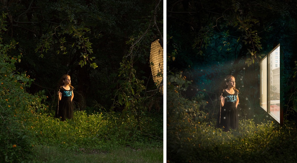
In the morning, we set up the camera pretty much touching the ceiling and looking down at us, and I photographed it by remote.

Post-production was pretty straightforward, there isn’t a lot there. Everyone assumes the pages are photoshopped on, but can you imagine what a pain that would be? The only significant photoshop tweaking was to shift the pages along the wall just slightly so they were right dead set in the middle. Otherwise lots of edits for colour and feel.

The end product is something I’m really proud of, because it’s our story. I’m glad the judges saw something in it; it’s great that something so personal crept over the line and (after a challenge) scored a Silver at APPA 2015. (Yes! Got a silver medal for a selfie!!)

One really amazing thing about this image is the way people connect with it. Nearly everyone that looks at it can see a bit of their life in there. Maybe they’re the sleepless one, or maybe they see that in their partner. I feel more connected with people after we talk about how the image affects them. What do you see?

Most images are collaborative, often involving a big group of people. I completely owe this image to Wanda, for being the inspiration, for the hard yards in set dressing, for being in it, and for critiquing my edits as it slowly became this print. She has a hand in pretty much everything that we do, and this one was no exception, but I’m honoured that she would entrust me with telling her story.


Generations

Generations is a pretty important print for me, for a bunch of reasons. It’s taken a really long time from conception to closure. I think it’s done now. Here’s the story.

Conception

A few years ago I was thinking about how to tell a story about how music is timeless and important. In my life, music is pretty important; I’ve been a piano player for about as long as I can remember, through all of the highs and lows, three round-the-world relocations, all of my school and uni and single and married and parental life. I thought it would be cool to capture that somehow, and I was thinking through ways of showing a piano and its passage through time.

(Side note: Why do I have to love photographing pianos so much! They’re a massive pain to move! How about a nice guitar, or a harmonica maybe?)

I was working through ideas about seasons, or the evolution of a single place around a piano. Then the idea of a multiple image story popped in to my head, structured around a piano that moves from left to right as time passes. That quickly grew in to a story about the boy that belonged to that piano (or vice versa?) and how he grew up and changed. The story grew by itself, until the main building blocks were there.

I remember driving with Wanda, explaining each of the four panels one by one. When I started on panel number four, she started crying, because she knew exactly what I was going to do. I guess that’s good 🙂 The main impediment at that stage was skill; I was pretty sure I didn’t have the chops to shoot it, light it, and composite it to make it happen. I’d recently worked on a poster for a production called Critical Hit involving similar composite work, but I wasn’t quite ready yet. So I parked it for a couple of years.

Planning

I like to sketch out my ideas first. It helps when there are iPad sketching apps with lovely watercolour brushes that make your work look half decent. (I use Paper by FiftyThree.) So here’s the sketch outlining the general plan.

Execution

Next step – location scouting and casting! The location part was tricky; I couldn’t quite find a location that met the brief. Enter our amazing clients, Aimee and David. We’ve had the privilege of photographing their wedding as well as their ever-growing family on a few occasions. Their house nearly fit the bill. They did most generously allow me to remove all of the furniture from one of their rooms and shoot it from a few angles to get enough to composite it in to a bigger room. And voila, one room.

Now for the casting! Aimee happened to be quite significantly pregnant late last year, and that’s where the casting started. A bunch of people jumped in with both feet, and I am very appreciative of their time and effort! That goes for the piano too. Even the window shades from my parents’ place in Las Vegas made an appearance.

Can I say a massive thanks to everyone that appeared in this project: Aimee, Fiona, Roger, JC, Declan, Aaron, Tara, Gabby, Michael and Rose. You guys completely made this possible.

Shooting was anywhere and everywhere – loungerooms all around Brisbane were turning in to studio spaces for this project.


Speeding it up

Generations got over the line at the Queensland awards with a Silver award, and that was very cool indeed. I did get quite a bit of consistent feedback from judges along the lines of… “AAAAH, Right! I get it now! I didn’t see all of that when I was judging, but NOW I do! Hey that’s great!” which to me is code for “Nice job, but takes too long to read – make it faster!” That advice, plus advice from a few trusted mentors, resulted in a bunch of changes, including losing the girlfriend’s friends (agh sorry guys), reshooting the boy’s older family (c’mon guys, you looked pretty young before), and removing a few elements that cost more in reading time than they gave back in story and understanding, like the text on the boxes, the box on the piano, and so on. The new print felt a lot faster to read – still very full of detail and story, but hopefully something that the judges could see most of in the limited time they have with the print.

APPA!

At the judging, this one scored a solid silver on the first round, with four judges in the mid-80’s, and one judge in the low 90’s. I’m very very happy that the 90’s judge challenged, spoke passionately about the print and what they saw, and on rescore helped a few other judges to move up as well, bringing this up to Gold! A gold award is pretty exciting. I figure it’s going to be a rare, rare feeling to earn one of those. I’ve probably put more work in to this print than any other print in my life, and I’m glad the work was rewarded 🙂

The evolution vids have been getting a good rap, so here’s the evolution of this print… Enjoy!


The Patient

Here’s the second of the 2015 APPA prints – The Patient.

Story

We have a friend that is going through some medical issues at the moment, involving many trips to the hospital for tests and procedures, and quite a lot of uncertainty. I have never once seen them complain about what life is throwing at them. Quite the opposite – talking to them and reading their posts on social media, they’re staying completely positive and taking everything that life is throwing at them, with one eye on the fight and the other on the future. I approached our friend to see if I could photograph them and tell their story with an image.

After geography turned out to be a bit of an impediment, we decided to tell the story with a different model, and the concept continued to evolve. Friend of the family Isla stepped in as our model, and suddenly having a young girl as the subject changed the story even more.

One thing before I start. When you look at an image like this, it might take a little while for you to unpack it in your head, and decide what it means. Whatever interpretation you come up with is completely correct! Sometimes people will tell me what they think it’s about, then say “OK what does it really mean”, then wonder if they’ve offended me because they interpreted it differently. From my point of view, if I’ve left enough ambiguity in the image, your interpretation will feed itself, and it’s just as right as another. So no matter what your interpretation is, I hope you enjoy it!

To me, this image is about a girl that is in hospital and is quite unwell. She doesn’t get to leave, so she’s built an imaginary place for herself to live. Little bits of reality poke through in to her fantasy world though – her drip, her hospital gown… and a portal to the outside world, with all of these people going about their business. And she’s looking at them and wanting to be out there… somewhere normal, somewhere we might not appreciate, but she longs to be there.

Production

First up – location. We traipsed all over the place, driving for hours and hours, to find the perfect location. Along the way we got lost and probably picked up 5 ticks between us. In the end we found a perfect spot about three minutes’ walk from home. Go figure.

For most images I’m pretty keen to do some kind of test to make sure the geometry and composition works. Usually it’s a sketch. I don’t mind adapting when the shoot is on, but I’d much rather work out the kinks ahead of time so everything is easy peasy when we come to do the shoot. For this one, I took our daughter to the location where we would shoot the final image, and shot a few test frames with our gigantic gridded octobox. It was a really quick shoot, and she did a super job… considering she was being eaten alive by a bazillion mozzies. I am a bad, bad parent. 🙁 

Meanwhile, Wanda took a dress we picked up at a Queensland Opera costume sale, and altered it to suit the brief – organic and flowing, with hints of a hospital gown peeking through. We also organised props – a drip pole, an IV bag (thanks Natalie!), and the hospital bracelet from when Wanda had one of the kids in hospital.

On the day, armed with bucketloads of bug spray, we headed down to our location. The shoot didn’t take too long, Isla was a pro, and we got what we needed. And more!

Most of the work with this image was the composite work to add the floating window, as well as butterflies (most of which we shot in India last year) and flowers to convey that this forest is a good place.

The second iteration of the image embedded the window in a wall (courtesy of the Brisbane Powerhouse) and changed the perspective a little bit, as well as adding people from outside.

Here’s a detail shot that shows some of the bits that I care about – Wanda’s hospital ID band, the hospital stamp on the dress/robe, the little happy blue flowers, and the recessed bit of wall for the window.

Awards

The earlier version of this print (with the floating window) received a Silver with Distinction at the 2015 QPPA awards. One of the best thing about showing your prints at the state awards is getting feedback during or afterwards – imagine having access to a whole bunch of really accomplished and articulate judges for feedback! Here’s a little glimpse of the edits to go from QPPA to APPA:


After some refinements, the version with the wall received a Silver at the 2015 APPA awards. Why did the score go down, you might ask? Is it not as good now? The standard at the national level is pretty high, and I think they are (correctly) holding prints to a very high standard when judging. There are a ton of variables that might influence the score – that’s part and parcel of entering a print competition, and I’m totally cool with that. I saw a great many prints go by at the APPAs that were very high quality but just missed out on a Silver award, so I know the judges are working hard to ensure the best of the best get awards. I’m ok with that, and it makes me doubly proud that this image got over the line.