After our set of solo character pieces for Titanic, we had an idea for a Titanic advertising image that would totally convey the careful balance of epic theatre, audience participation, and low-budget special effects that make Act/React productions so much fun. Taking imagery from the original movie as inspiration, we put a concept together to be shot on-set at the purpose built Titanic made by the Queensland Maritime Museum.
Sometimes photography is all about problem-solving. My team set up the shot while the cast were getting prepped and ready. We had the lighting and set up all good to go, and most of the cast members on-site… when word came through that due to circumstances beyond anyone’s control, we had fifteen minutes to completely vacate the venue. Fifteen minutes!!
Part of our preparation for sessions like this is a detailed shot list, with details of each shot, the talent, the technical setup, any props, and guidelines for the posing and emotional states we want to travel through to give us not just the must-have shots but bonus shots that may end up getting a spot in the final piece. When the time constraint came down, we smashed this shot out (a composite of about eight different shots) in eight minutes flat. Full marks to the cast, who quickly took direction and somehow managed to make breathing space so their characters could explore the emotions they needed for the shot.
UPDATE; This image scored a Silver with Distinction at the 2019 Queensland Epson Professional Photography Awards, and was part of our portfolio as a finalist in the Commercial division.
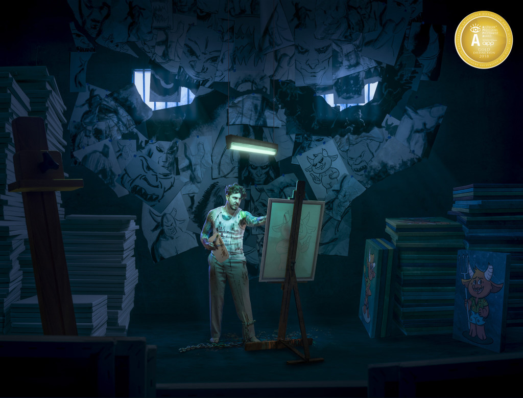
In 2017 I had a conversation with a photographer friend of mine about the differences between our work. My work is usually dark, sad, and focused on unpleasant feelings or realisations. Their work is frequently uplifting, hopeful, with wonder about the universe and our place in it. My friend said – “Well, the work I sell is like that… the work I make for myself is very different.” That was a great inspiration for what would hopefully be an exciting print.
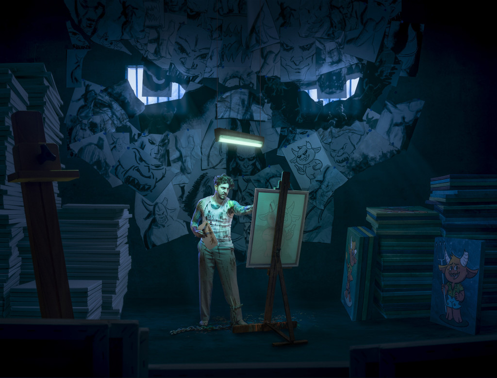
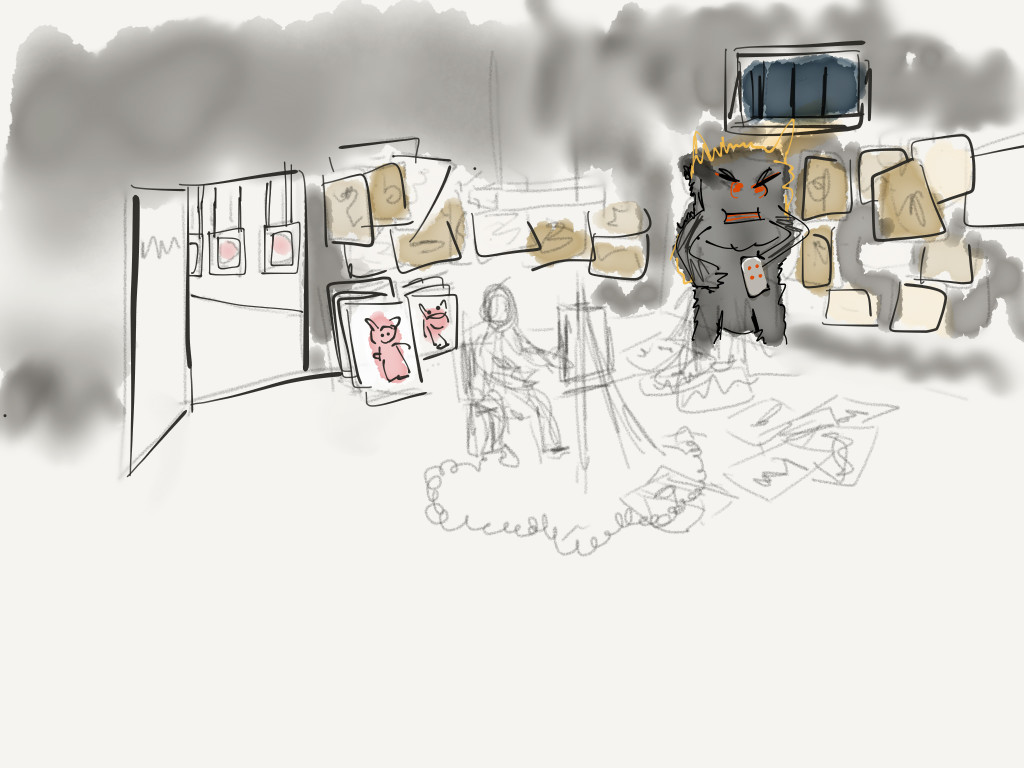
After turning it over in my head for a while, I cooked up a visual of an artist in a cell, enslaved by a huge, hulking presence, and forced to sell artwork. Even though the artist sketched tortured, haunted images of that muse, they dutifully created commercial, saleable pieces that would sell like hotcakes. (Think cutesy, like Minions.) Originally this was going to be a sort of split-down-the-middle shot, with a super-commercial art gallery on the left, staffed by peppy smiling sales staff, checkerboard floor, big posters and prints and figurines… with a door leading to the back room, a concrete cell with the artist forced to work day and night to make the work. The meat of the story was the workshop, and over time it morphed in to a composition about that workshop, with an open door so the viewer could glimpse the gallery.
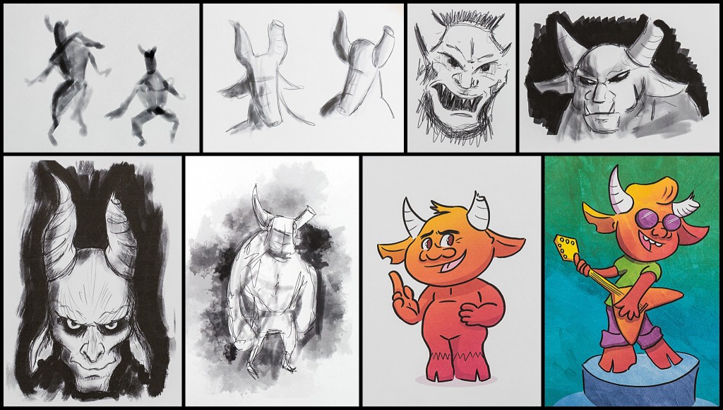
I have a very important collaborator for this image – Sean Dowling. Sean is a talented artist/illustrator/graphic designer/actor/you name it. I met Sean working with ImproMafia several years ago, and we’ve both contributed to the same commercial pieces in the past, but never as collaborators. I pitched the idea to Sean, asking if he would not only play the role of the tortured artist, but sketch and draw all of the creatures for the finished piece. Sean jumped in with both feet!
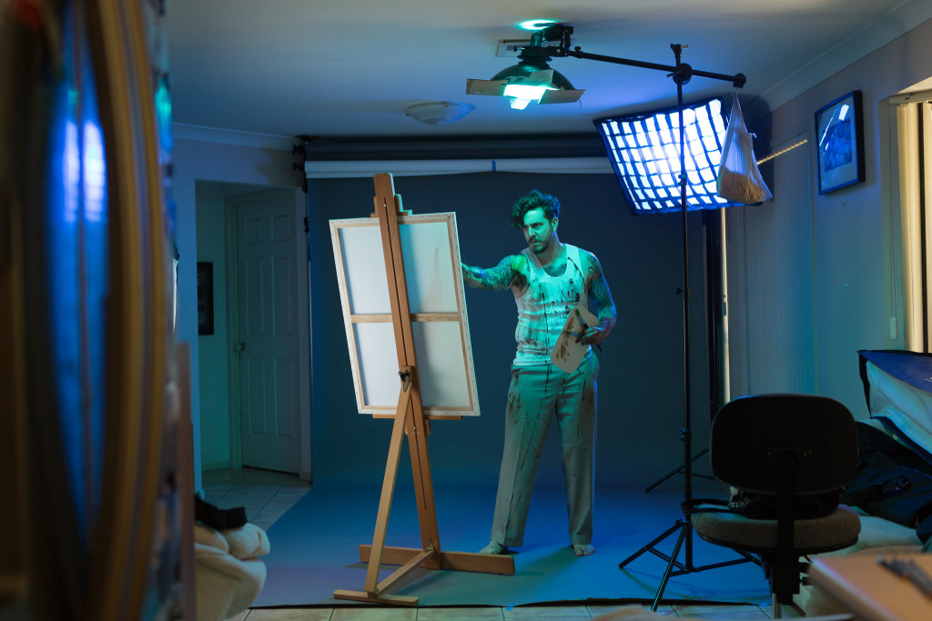
What I didn’t have was a location. Getting all of this right in camera would save a ton of time and effort. I’d scouted around for some good concrete box rooms where I could have easy access, with no luck. So – time to create a room from scratch. With lighting to match the light sources in the sketch, and an investment of $5 in clothes from Vinnys, Sean got all painted up and we spent an afternoon shooting tortured-artist poses. Later I put on some chains (a prop from the Brisbane Arts Theatre’s production of The Crucible), so in the final version one of those feet in the shot is mine!
Sean’s artwork was amazing; he nailed the brief, and brought a lot of himself to the pictures. He showed such attention to detail; even in the roughest of sketches, he ensured the creature’s left horn was broken, and in many of them the creature had a bite taken from the right ear – hopefully touches that would help the viewer realise these were all in fact the same creature.
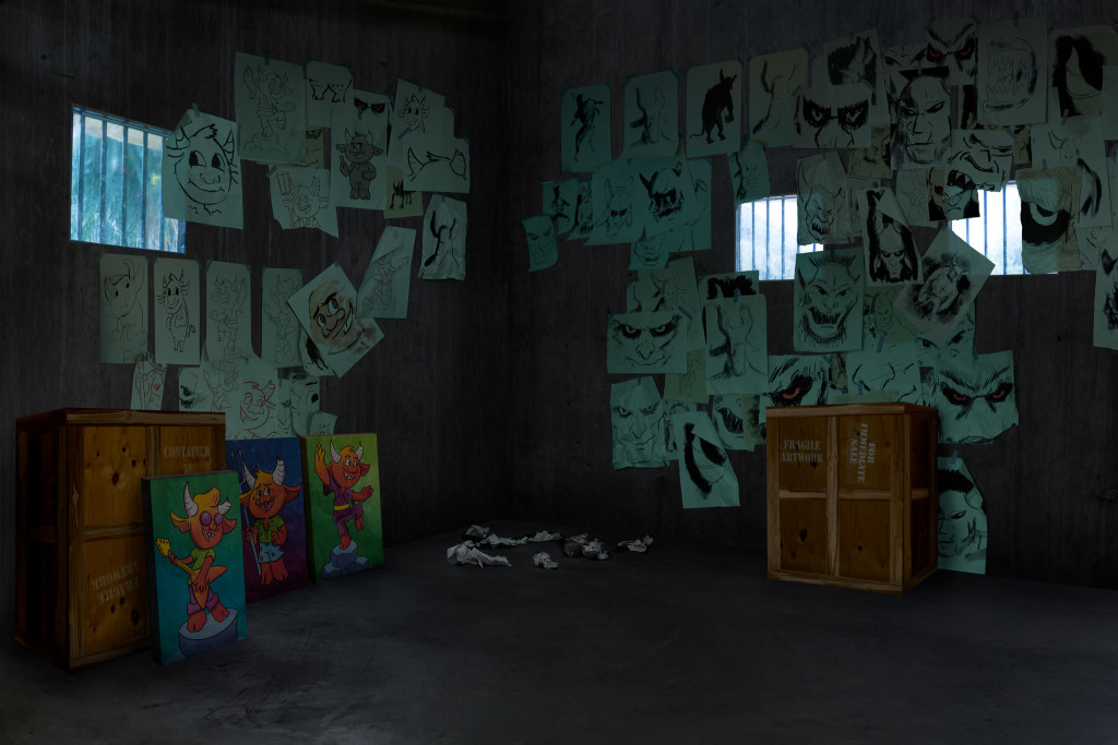
After a bit of work, it was obvious the first composition wasn’t going to cut it. The bright gallery on the left of the image, while important narratively, just sucked way too much attention. When your eye fell on the image, it hung around that door first, visited everything else, then came back to the doorway. That wasn’t what I had in mind at all. After trying a bunch of different gallery looks, I decided to take that gallery out. Narratively the image would need a different way to imply a workflow of image creation, but the gallery wasn’t it.
To give it that print-production-workflow and make the viewer understand this guy had volumes of work coming through, instead of the gallery, crates of canvases did the job. As always, there are some super-low-budget constructions in here. The crates of prints are fashioned in photoshop from the back of a bookshelf and some fence palings. And the barred windows? Take a regulation 40x50cm APPA-sized picture frame, spray bug spray on the glass to make it opaque, and gaff it to the pool fence. Voila – dirty barred window. (Note to self – don’t leave it up overnight because it’ll fall and the glass will smash. Oops.)
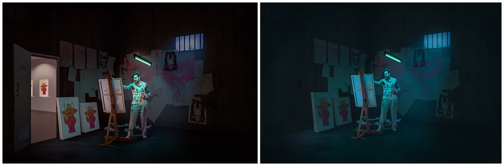
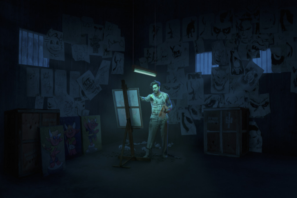
This version went to the Queensland Professional Photography Awards, and scored an 83, a Silver. Not too shabby. Sean wasn’t satisfied though. He pointed out the similarities between this image and Sleepless, and pushed me to do better. So – time to start from scratch. In this version, the artist is alone; he’s haunted, but the thing haunting him isn’t really present. How to make it a massive part of both the narrative and the image? Hey, those two windows on that back wall look a little like eyes… Hmm…
In the new version, every sheet of paper is separate, and they each have their own shadow, toning, and image laid over it. I think this is as close to “painstaking” as I get. The other big surprise was realising I needed to make a stack of 60 or 70 canvases, when we only had four in the house to be used as props… Talk about making life hard for yourself.
I could talk about how it came together, but… instead, watch the video at the end of this entry. It does a much better job.
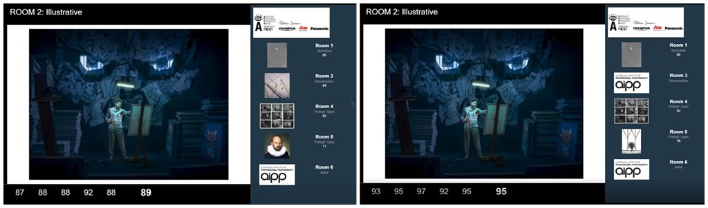
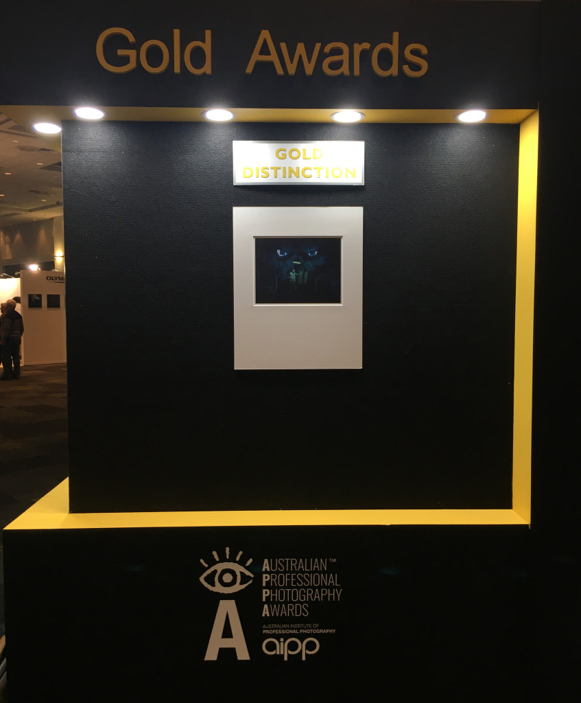
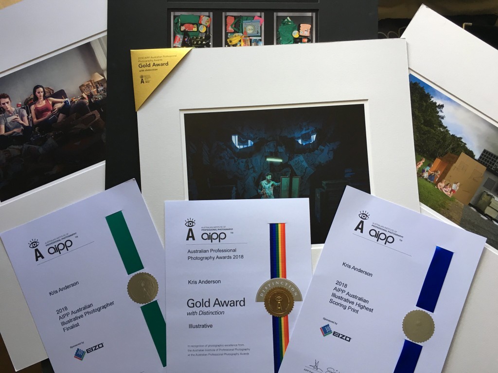
At the 2018 AIPP Professional Photography Awards, this was my third print up. It scored a very, very solid 89 after the first round of judging. Steve Scalone (genius travel and architectural photographer) was on 92, and put his hand up and made one of those challenges you REALLY want to get as a photographer. He touched on the narrative, the composition, the layering of stories… and since this is the first time I’ve ever printed my own work, it was gratifying to hear him say it was masterfully printed. The other judges who spoke were positive as well, resulting in Steve asking them to jump past his score and bring it in to the 95-100 Gold Distinction range. Three judges did just that! At the end of the day, this image scored a 95, a Gold Distinction, and was the highest scoring print in the Illustrative category. I don’t remember the judging too well, but I do remember my bones turning to jelly and me collapsing in a puddle in my chair next to Wanda when the final scores came through.
The scores after the first round of judging, then after Steve’s challenge. He couldn’t move his score of 92.Bucket list item – get a print on this wall. TICK!
Biggest thanks to my family, for always always supporting me in whatever crazy projects I decide to kick off. I love you guys 🙂
MASSIVE thank you to Sean for collaborating with me on this. I’m really proud of this piece, and you should be too.
One of the things that was mentioned in the judging is the quality of image in the dark parts of the picture – there’s detail all the way through. Afterwards Steve asked me “You had blacks on blacks! How did you do that?!?” I’ve had the wonderful support of Eizo this year, and one of their monitors on my desk has made all the difference; there’s no way I could have kept so much detail in the darker parts of the image without a professional tool like my Eizo CG2730.
If you want to see this image as it evolved, and listen to the judges talk through it, grab some popcorn and watch this video!
The Muse has a few more outings where it will be judged; send some good vibes. Doesn’t matter how it goes though, really; I like it, and that’s all that matters.
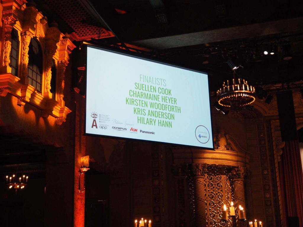
2018 marks the sixth year of entering the AIPP Australian Professional Photography Awards. Last year was pretty spesh and a hard one to beat! I’m proud of not just my achievements, but the achievements of a bunch of very very clever and talented friends that created amazing work, had the guts to enter it, and sometimes got it over the line (sometimes with massive accolades)!
Massive congrats to everyone that entered, and especially to the category winners and overall winner! Check out their work. These are the best of the best.
This year I had four prints in the Illustrative category, all refinements of the prints from the Queensland awards earlier in the year. And by “refinements”, in one case, I mean a complete reshoot from scratch. Did that pay off? Forge ahead, dear reader, to find out.
As well as all the usual excitement about creating and judging award prints, this year another photographer Melissa Neumann and I tried something a bit of fun. As a photographer entering the awards, one of the most frustrating scores to walk away with is a 79. It is just one point shy of a silver award, and (at a national level) it means it scored a 79 on the first time through, then with a second panel of review judges it stayed on 79 rather than tipping up to 80. So it’s a bit of a bummer to score a 79… and we wanted to have some fun and some community-building with that! We created The 79 Club (lifting an idea from Melissa Ghionis and the WPPI) – if your print scored and stayed on 79, and you came to see Mel or I, we’d furnish you with your very own 79 Club badge. Part of this was so you could see and commiserate with fellow 79ers at the bar (“You too?” “Yep” “Cheers”)… also so you could see that even rock star photographers fall in to that club! Pleased to see that people were excited to get badges, and sometimes a little disappointed to get an 80 and miss out. 😀
I’m pleased that all four prints of mine got over the line this year. The Checkout snuck over with an 80, The Feed went up to 80 on review (nearly got a badge!!), Grownup Machine earned an 82. My favourite print this year, the one that I poured a lot of time in to, The Muse, did spectacularly well – on a challenge, it went up to 95 – a Gold Distinction, the highest score I’ve ever received for a print, and the highest scoring Illustrative image of APPA 2018!
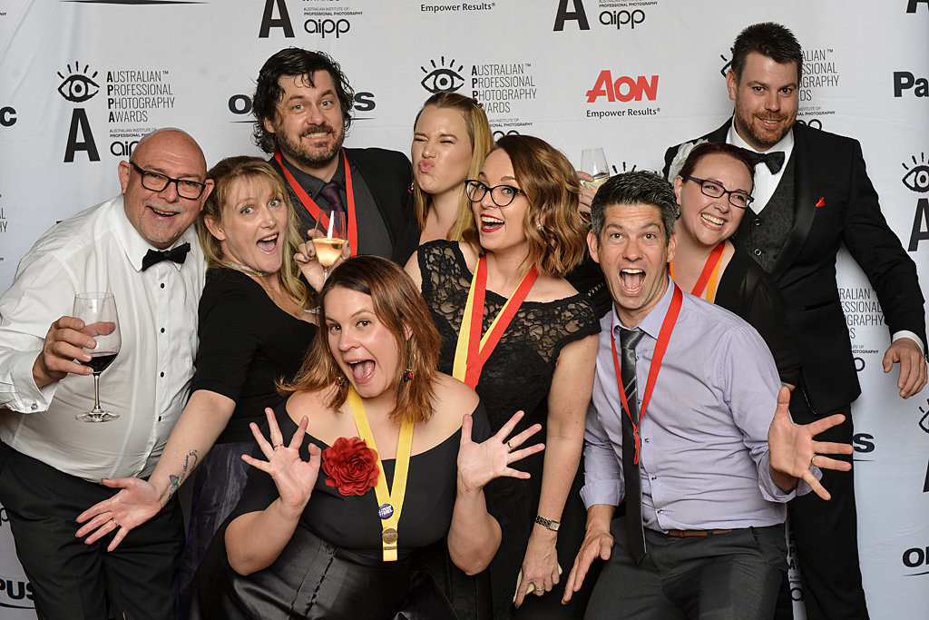
It’s always excellent to see and reconnect with friends at the APPAs too, including sharing a house with funsters and eating and drinking and playing games and talking until all hours like a bunch of uni students. Always a shame to have to come home and back to reality afterwards 🙂
GIANT THANK YOU PARAGRAPH: Thank you first to my family especially my gorgeous wife Wanda; they support my crazy projects and they are the best! To everyone that contributed to these, as a subject, an idea-generator, an artist, or a critiquer – thank you! I have the best bunch of finicky critiquers you could find. Thanks to Shane McCaffery for teaching me printing so I could print my own images this year. Eizo has been a big supporter this year, and I am 100% sure I wouldn’t have had this success without an Eizo monitor on my desktop. Two thumbs up to Epson and Canson for the machine and the media to make these prints sing.
OK, enough yapping. Here are some photos.
Shopping Basket
We use cookies to ensure that we give you the best experience on our website. If you continue to use this site we will assume that you are happy with it.Ok


 This version went to the Queensland Professional Photography Awards, and scored an 83, a Silver. Not too shabby. Sean wasn’t satisfied though. He pointed out the similarities between this image and Sleepless, and pushed me to do better. So – time to start from scratch. In this version, the artist is alone; he’s haunted, but the thing haunting him isn’t really present. How to make it a massive part of both the narrative and the image? Hey, those two windows on that back wall look a little like eyes… Hmm…