The Muse

In 2017 I had a conversation with a photographer friend of mine about the differences between our work. My work is usually dark, sad, and focused on unpleasant feelings or realisations. Their work is frequently uplifting, hopeful, with wonder about the universe and our place in it.  My friend said – “Well, the work I sell is like that… the work I make for myself is very different.” That was a great inspiration for what would hopefully be an exciting print.

QLD2018-AndersonK-4

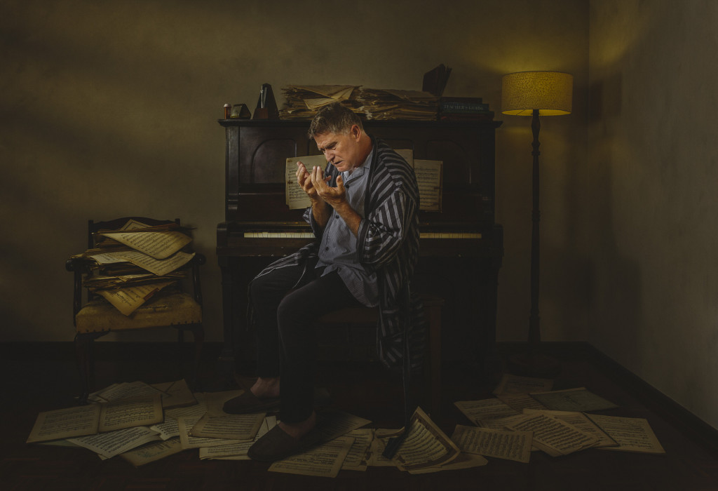
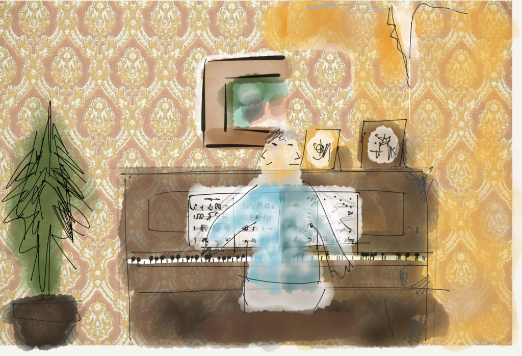
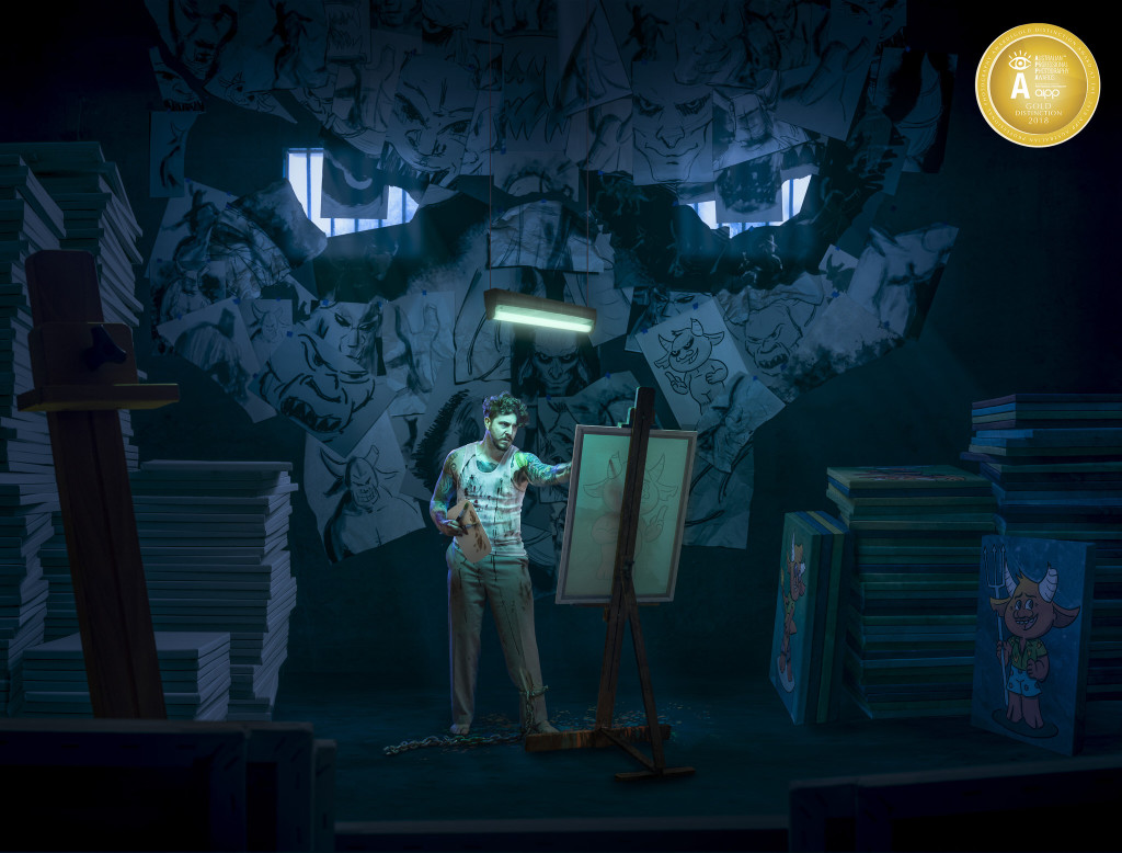
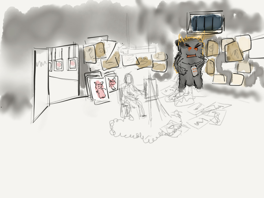
After turning it over in my head for a while, I cooked up a visual of an artist in a cell, enslaved by a huge, hulking presence, and forced to sell artwork. Even though the artist sketched tortured, haunted images of that muse, they dutifully created commercial, saleable pieces that would sell like hotcakes. (Think cutesy, like Minions.) Originally this was going to be a sort of split-down-the-middle shot, with a super-commercial art gallery on the left, staffed by peppy smiling sales staff, checkerboard floor, big posters and prints and figurines… with a door leading to the back room, a concrete cell with the artist forced to work day and night to make the work. The meat of the story was the workshop, and over time it morphed in to a composition about that workshop, with an open door so the viewer could glimpse the gallery.
01-Photo 20-12-17, 9 24 59 am

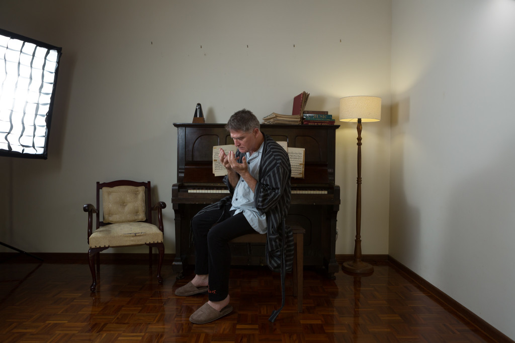
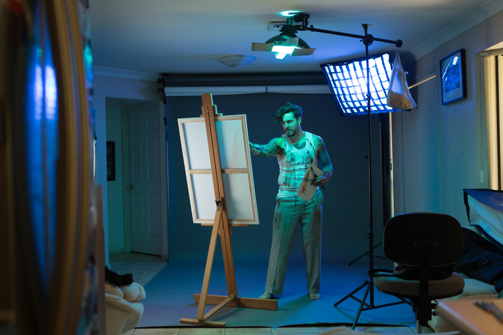
I have a very important collaborator for this image – Sean Dowling.  Sean is a talented artist/illustrator/graphic designer/actor/you name it. I met Sean working with ImproMafia several years ago, and we’ve both contributed to the same commercial pieces in the past, but never as collaborators. I pitched the idea to Sean, asking if he would not only play the role of the tortured artist, but sketch and draw all of the creatures for the finished piece. Sean jumped in with both feet!

What I didn’t have was a location. Getting all of this right in camera would save a ton of time and effort. I’d scouted around for some good concrete box rooms where I could have easy access, with no luck. So – time to create a room from scratch. With lighting to match the light sources in the sketch, and an investment of $5 in clothes from Vinnys, Sean got all painted up and we spent an afternoon shooting tortured-artist poses. Later I put on some chains (a prop from the Brisbane Arts Theatre’s production of The Crucible), so in the final version one of those feet in the shot is mine!
10-A1803_180210_A6090

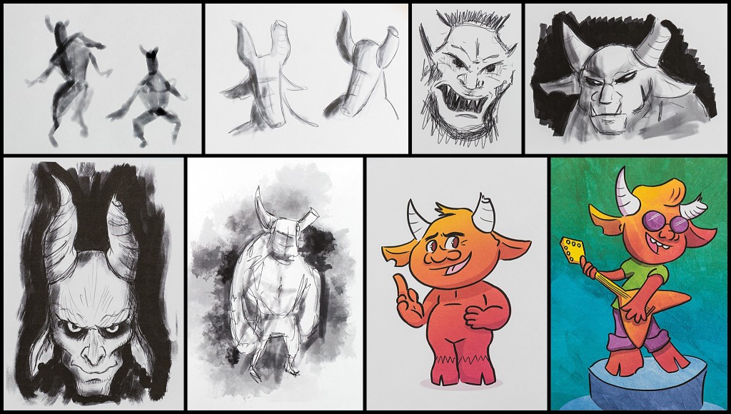
Sean’s artwork was amazing; he nailed the brief, and brought a lot of himself to the pictures. He showed such attention to detail; even in the roughest of sketches, he ensured the creature’s left horn was broken, and in many of them the creature had a bite taken from the right ear – hopefully touches that would help the viewer realise these were all in fact the same creature.
2018-10-01_0002

After a bit of work, it was obvious the first composition wasn’t going to cut it. The bright gallery on the left of the image, while important narratively, just sucked way too much attention. When your eye fell on the image, it hung around that door first, visited everything else, then came back to the doorway. That wasn’t what I had in mind at all. After trying a bunch of different gallery looks, I decided to take that gallery out. Narratively the image would need a different way to imply a workflow of image creation, but the gallery wasn’t it.
2018-10-01_0003

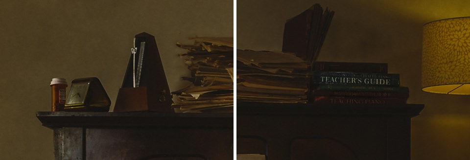
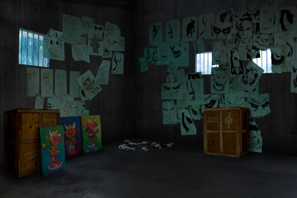
To give it that print-production-workflow and make the viewer understand this guy had volumes of work coming through, instead of the gallery, crates of canvases did the job. As always, there are some super-low-budget constructions in here. The crates of prints are fashioned in photoshop from the back of a bookshelf and some fence palings. And the barred windows? Take a regulation 40x50cm APPA-sized picture frame, spray bug spray on the glass to make it opaque, and gaff it to the pool fence. Voila – dirty barred window. (Note to self – don’t leave it up overnight because it’ll fall and the glass will smash. Oops.)

A1803_Muse_07a-AddCratesAndCanvases QLD2018-AndersonK-2 
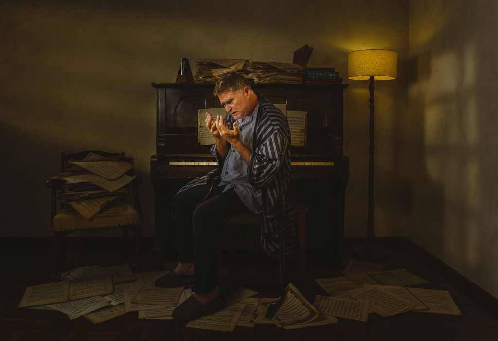
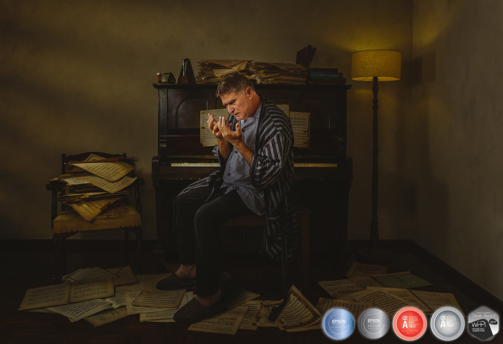
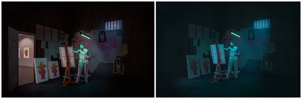
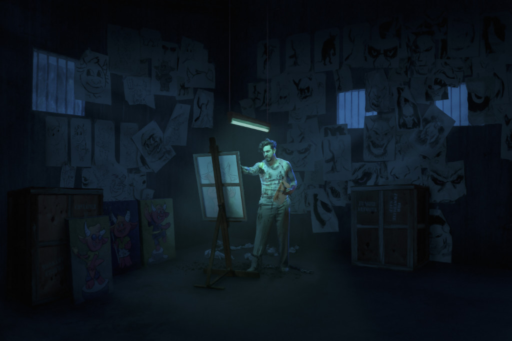
This version went to the Queensland Professional Photography Awards, and scored an 83, a Silver. Not too shabby. Sean wasn’t satisfied though. He pointed out the similarities between this image and Sleepless, and pushed me to do better. So – time to start from scratch. In this version, the artist is alone; he’s haunted, but the thing haunting him isn’t really present. How to make it a massive part of both the narrative and the image? Hey, those two windows on that back wall look a little like eyes… Hmm…

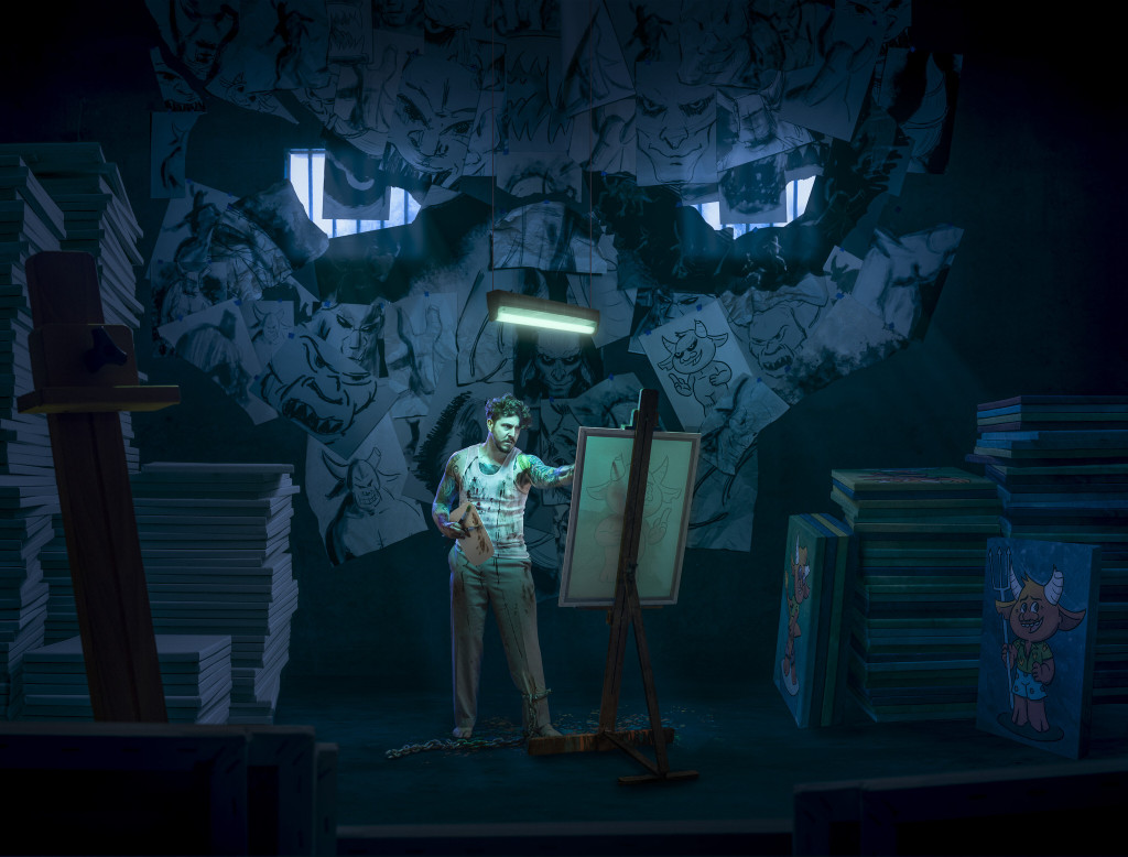
In the new version, every sheet of paper is separate, and they each have their own shadow, toning, and image laid over it. I think this is as close to “painstaking” as I get. The other big surprise was realising I needed to make a stack of 60 or 70 canvases, when we only had four in the house to be used as props… Talk about making life hard for yourself.

I could talk about how it came together, but… instead, watch the video at the end of this entry. It does a much better job.
QLD2018-AndersonK-4-nomedal

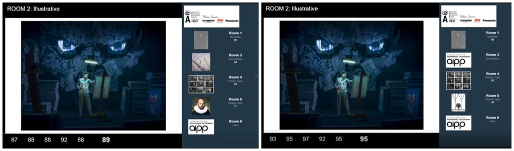
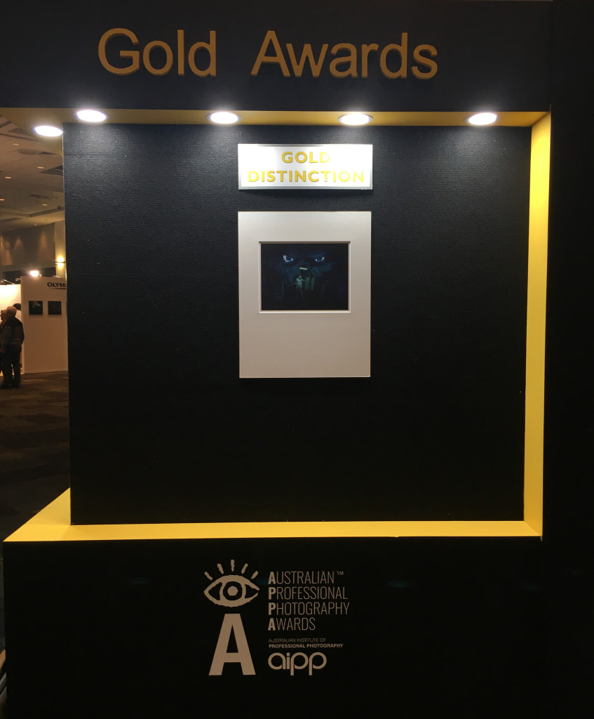
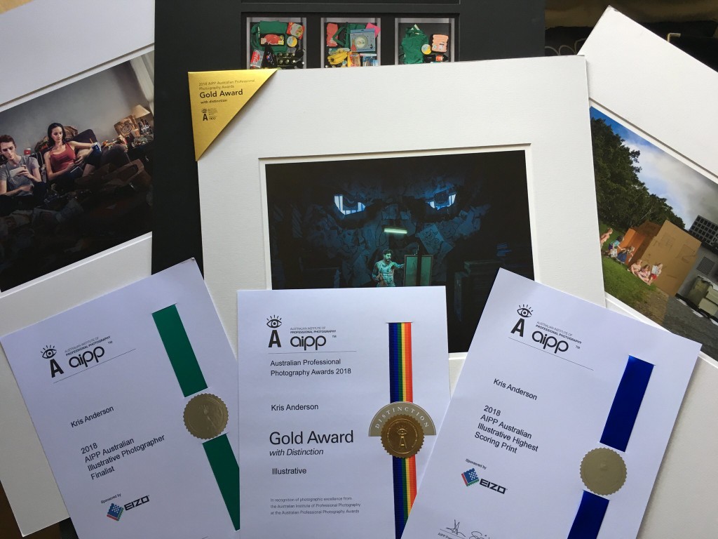
At the 2018 AIPP Professional Photography Awards, this was my third print up. It scored a very, very solid 89 after the first round of judging. Steve Scalone (genius travel and architectural photographer) was on 92, and put his hand up and made one of those challenges you REALLY want to get as a photographer. He touched on the narrative, the composition, the layering of stories… and since this is the first time I’ve ever printed my own work, it was gratifying to hear him say it was masterfully printed. The other judges who spoke were positive as well, resulting in Steve asking them to jump past his score and bring it in to the 95-100 Gold Distinction range. Three judges did just that! At the end of the day, this image scored a 95, a Gold Distinction, and was the highest scoring print in the Illustrative category. I don’t remember the judging too well, but I do remember my bones turning to jelly and me collapsing in a puddle in my chair next to Wanda when the final scores came through.

2018-10-01_0004
The scores after the first round of judging, then after Steve’s challenge. He couldn’t move his score of 92.
Photo 26-8-18, 5 16 57 pm 2
Bucket list item – get a print on this wall. TICK!

Biggest thanks to my family, for always always supporting me in whatever crazy projects I decide to kick off. I love you guys 🙂

MASSIVE thank you to Sean for collaborating with me on this. I’m really proud of this piece, and you should be too.

One of the things that was mentioned in the judging is the quality of image in the dark parts of the picture – there’s detail all the way through. Afterwards Steve asked me “You had blacks on blacks! How did you do that?!?” I’ve had the wonderful support of Eizo this year, and one of their monitors on my desk has made all the difference; there’s no way I could have kept so much detail in the darker parts of the image without a professional tool like my Eizo CG2730.

If you want to see this image as it evolved, and listen to the judges talk through it, grab some popcorn and watch this video!

The Muse has a few more outings where it will be judged; send some good vibes. Doesn’t matter how it goes though, really; I like it, and that’s all that matters.

Photo 1-10-18, 1 55 26 pm


Senseless

Senseless is one of our recent Illustrative pieces that has really hit home for people. Here’s a bit of an evolution of the print.

Concept

I find that it’s really easy for me to zone in to my phone and enter that unreality in there. Lots of things to keep you occupied – social media, news, email, blog posts… back to social media again… it’s just a little bit too easy to enter that phone zone and not really exist in the real world any more.

For me, I know that one day I’m going to turn around and the kids will be all grown up. Sometimes I just want to press pause and keep them just where they are so I can experience it for a little longer. So I’m even more dumbfounded with myself when I realise that I’ve missed entire conversations and entire experiences because I was too busy scrolling through a news feed. I wanted to make an image that captured that – the world passing by while someone was ensorcelled in the little soul box.

0-2017-04-27_0001+2000px
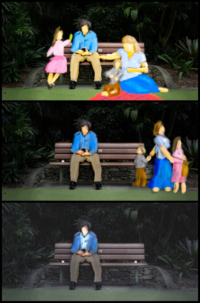
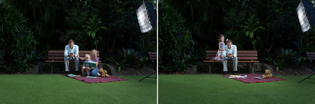
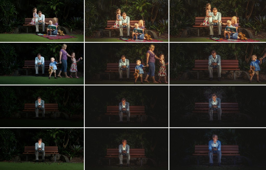
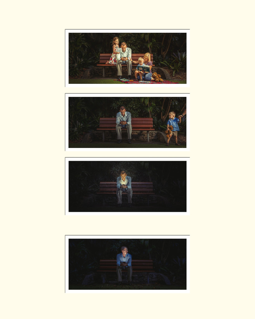
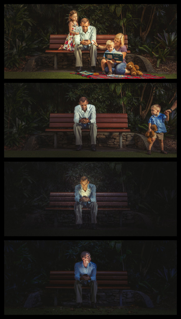
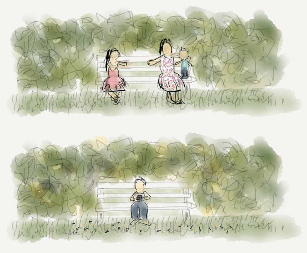
The original concept was a two-hander, two images that were to represent the same place and time, with someone out of phase from the rest of their family… on their phone, missing out on a beautiful day in the park. One of those days you remember for a long time. In that isolated person’s version, everything was a little lifeless, with dead leaves on the ground and other clues to show… wrongness.

That concept bounced around for a year or so without quite moving forward. After a while, it morphed in to another version showing the passing of time, and the person being oblivious to their family moving on. After hunting for a location, we realised one of the benches we like to use for family sessions at the Mt Cootha Botanic Gardens would be pretty perfect.

2017-03-04_0002

Prototypes like this are really useful to test out ideas before the final shoot. Things like… Where should the guy be sitting? In the middle, or just off to one side? What kind of clothes should he be wearing to best convey that he’s wet later on? What should the kids be wearing? Is that red picnic blanket picture perfect or too distracting? While it’s a sketch, the cost to change things is really low; you’re not bothering anyone or wasting their time.

The shoot

With location and wardrobe pretty much sorted, casting was the final piece ahead of shooting. Some good friends of ours, the excellent and very photogenic Stefan and Laurene Cooper-Fox, have a little family that was just right for this. Even better, Stefan and Laurene are photography buddies of ours. Stefan and I have been performing together for decades, and when photography started to bite, he was the one that taught me studio lighting and how to work with clients. We all lean on each other for equipment and for help with shoots, and Stefan and I have both second-shot for the other doing weddings. (Stefan and Laurene run CF Photography, and we’re proud to be associated with them.)

Our daughter Tara was my most excellent assistant. When we left the house to head to the shoot, the plan was still three panels. In the ten minutes on the way there, we talked about how it was sad and poignant but didn’t quite have the sting in the tail that it needed to really hit home. So we came up with the idea of trying a fourth frame, where the man looks up and over, realising that they’ve gone, wondering where they went.

Shoot-wise this was very simple. One speedlite off the right edge of the frame to be the setting sun; a second off the left edge for some fill. A third when needed to replicate the light from the phone. Not a lot of photoshop trickery either; a little composite work to get everyone together the right way. Very handy to have a completely static Stefan in the middle.

2018-01-19_0001

Stefan was an absolute champion in this shoot. He sat dead still for the better part of an hour. Have you ever sat dead still, hunched forward, not able to fidget at all? It’s pretty hard! Sooooooo let’s make it harder and soak him to the skin! Good times!! I think he was relieved once the session was over. Here’s Tara with the phone-light-speedlite, while Laurene pours water on Stefan’s head.

A1621_170305_A2304

Putting it together

As it turned out, that fourth frame was the absolute perfect way to finish off the sequence. The edit for this came together very quickly, a couple of hours to get 99% of the way there, and then letting it sit and stew for a little while. The biggest change as it evolved was moving most of the family out of frame for that second panel.

I had a bit of an epiphany with this print during the editing process. Photographers lucky enough to own an Eizo monitor always rave about them. This was the first print I edited using an Eizo. It’s a really dark image, and I had to be super careful to know how it was going to print – were the details in the dark areas going to carry through? Or not? Or too much? Using the Eizo shortened my edit-print-refine workflow significantly; I got a much better representation of what the printed image would look like while I was editing. Now I’m one of those lucky photographers with an Eizo on my desk.

2018-01-19_0002

Awards

There was one little gamble entering this as an awards print. Each of the four frames had an individual window in the matt, with the last one offset by a little bit more than the others, to imply the passage of time. To date, I don’t think anyone has remarked on it at all. So either people dismiss it as an error, or it’s so obvious that it isn’t worth talking about… or no one has noticed. 🙂 You may have figured out that I prototype just about everything… this is the mockup of the mat layout.

A1621-mat-layout-1

As far as awards performance goes, you can’t really ask for more than this print has delivered.

Queensland Professional Photography Awards: I was floored to see this print get up in to the Gold range at the QPPAs, after a particularly excellent challenge from Mark Rosetto, one of the judges. Mark identified with the subject, and it affected him pretty deeply. If you want to hear his impassioned challenge, you can watch the livestream (fast forward to around 5:40). He kept the print up on the panel for 13 minutes, which is massive. As well as the gold award, this was part of the portfolio that earned the Queensland 2017 Illustrative Photographer of the Year.

Australian Professional Photography Awards: After actioning feedback from the judges in Queensland, this print scored a very respectable Silver with Distinction at the APPAs… and again was part of a portfolio earning the Australian 2017 Illustrative Photographer of the Year.

Wedding and Portrait Photographers International: When it comes to the big titles, WPPI works on prints rather than portfolios. In the 2017 2nd half digital competition, this print ended up in First Place in the Illustrative category. (As I write this, a physical print is tucked away in Las Vegas ready for the WPPI Annual print judging in a month or so.)

Blog-2000px-A1621_Badges

That’ll do, pig. That’ll do.


Massive thank yous to a few people. Stefan, Laurene, you and the kids did a brilliant job and I owe you big time. Stefan you were an absolute champion. Thank you to Tara my assistant, who wrangled kids and lights and leaves and everything else that needed doing. Thank you Shane McCaffery for delivering a perfect print (or twenty); the Epson – Canson combo came through again. And thanks Eizo for making such good product, and ultimately for sponsoring the Illustrative category.

Blog-2000px-A1621_APPA_COMPE


Noteless

Kris Anderson - Noteless

Music has been a big part of my life for a long time. I play the piano by ear, and since I was a kid I’ve been able to listen to a song and (mostly) play it back without any sheet music. This has served me well playing in bands and doing theatre work, and besides that, it’s a lot of fun. Plus – without that skill, I would never have met Wanda and have the life we have together today. So it’s pretty important to me. I was thinking one evening: I’m sure as I get older, my brain and my fingers aren’t going to work as well as they always have, until eventually I’ll sit down at a piano and… not understand what to do, not know how to get that stuff out of my head through my fingers in to the keys any more. It must be that way for anyone that does anything they love – maybe the ability to do it slips away slowly, maybe it goes in a rush, but there will come a day when that familiar thing you love to do becomes difficult and unfamiliar.

That feeling. That’s what I want to put in an image.

The first plan for this image was to show some kind of split reality with time passing – the young man at a shiny piano, fresh walls and plants, happy photographs… the old man at a well loved piano, faded wallpaper, evidence of change (and not necessarily happy change).

0-A1706 Tuneless - Sketch

I love images with that split-reality thing, but it seemed like it would be too hard to make the main subject work, and and transition the young version in to the old version without being confusing. Instead, let’s focus on the older version of the subject, and really focus on that moment when it becomes clear those hands aren’t going to play any more.

Perhaps there’s a way to ramp it up even more. What if the subject wasn’t just a musician… what if they were a teacher? So this isn’t just the end of their own music, it’s the end of teaching others? (Shane McCaffery and I talk about these images, and I’m pretty sure he gets the credit for that idea.)

As always, really important to pay attention to the big three when planning an image: Location, props, and talent.

Location: A space with the right sort of piano, the right sort of walls, the right sort of floors, and enough room to get some distance between the camera and the piano? No problemo. After a few promising leads (thanks Blair!), the perfect location presented itself, in the home of fellow photographer Lynda Coulson, who was happy to let me come in and disrupt her house for a morning.

Props: There are some really cool props in this picture. The sheet music comes from Michele Walsh, Head of Strings at the Brisbane Conservatorium of Music. After a lifetime of use, her teacher gifted the sheet music to her on his retirement; some of it is over a century old. That gave an incredible weight of history to the day of the shoot. Michele loaned the metronome as well. The other significant prop was a little travel clock, the sort of thing people recognise because their grandfather or grandmother had one just like it. If the viewer sees the clock, and in a small way connects with the subject by recalling their parents or grandparents, that connection would help to drive the message home. It took some hunting to track down a little clock like that… and once I had it, it seemed like every other person I spoke to could have gotten me one if I’d just asked. :/ The clock, the metronome, and the chair would hopefully set up a location that was clearly for teaching.

There’s a neat little easter egg to connect this image to me and my work with ImproMafia. A few years ago, when accompanying an improvised production, the musician was in the reality of the show, and the character I was playing was endowed with the name “Mr Smiggins”. In a later completely different show someone named me “Phil Smiggins”, and since then it’s stuck. I’ve even been the “Phil Smiggins Orchestra” for a season of shows (as a solo musician). So it was fun to title one of the books “Phil Smiggins Consolidated Piano Teacher’s Guide”.

2017-11-13_0001

Talent: I’ve been fortunate to photograph Brisbane actor Alex Lanham a number of times, and he was a natural fit for this part. On the day, as we revised the brief and talked about the character, he listened and processed, and then in the shoot gave me everything I asked for, then took it up a level, then another, then another.

0-A1709_170311_A2607

The edit for this image came together pretty smoothly – most of the work was doing lots of duplication of sheet music to give the room chaos.

There’s the addition of some light coming from an unseen window – hopefully evening light, that last bit of gold before it goes cold. One of the considerations for images like this is to keep every single element photographic, so there’s nothing that might disqualify it from being entered in the AIPP state and national print competitions. That light beam portion of wall is actually just lifted from the same photograph, using some of the wall with lamplight on the right side of the image – rotated, expanded, masked to give it shape.

For a little while, the light cast a very distinct shadow on the wall to the right, to make an in-joke that sightreading musicians would hopefully understand. It didn’t last; it kind of unbalanced the image and made it quite busy, which wasn’t really worth it to reward the small percentage of eagle-eyed musician viewers that would spot it.

A1709_170313_A2852A1709_V3lightE-6

It’s always a balancing act to work out how much ambiguity to leave in the image. The last element to be added was a bottle of pills up on the piano, to perhaps give an explanation of why the pianist can’t use his hands any more. Too much?

This print has seen a few print/image competitions, and it’s fared pretty well, with Silver Distinctions at QPPA and APPA (and part of the winning Illustrative portfolio for both of those), finalist in the Fremantle Portrait Prize, finalist in the Australian Photography Awards, and a Silver in the WPPI 2nd half 2017 competition.


File 13-11-17, 7 06 16 pm

If you enjoy our BTS videos, this one is special – we don’t usually do speed-edits, but we’re giving it a shot for this one!


Huge thank you to Lynda for lending her house, Michele for the sheet music and metronome, Tara for being an awesome assistant (again!), and Shane for bouncing ideas and for printing. As always, Canson paper on an Epson printer never lets me down, and injecting an Eizo monitor in to the mix helps me make sure the end result looks just right. And massive thanks to Alex for lending his acting skills and being a great subject.

A1709_V4E-2E-badges