2016 AIPP Queensland Professional Photography Awards

Every year, we challenge ourselves and enter some of our best images from that year in to the AIPP Queensland Professional Photography Awards. Last year was pretty awesome, and this year was similarly excellent, for different reasons 🙂

Lots of Firsts this year:

First time entering twelve images. You can enter up to twelve images in the awards, and up to four in each category. I went crazy in four categories – Illustrative (which was very successful last year), Landscape, and Travel. Eight of the twelve images made it over the line in to award territory, which is pretty excellent, including all four of my Illustrative images.

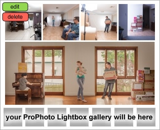
First time matting my own images. Photographs submitted for judging follow a pretty strict convention regarding size and matting. In the past, we’ve paid others to mat award images. This year, I thought… “I know! Mat all of them myself! Think of the money I will save!” I actually do think that it’s cost effective to mat your own entries… if you get them right each time. “Hi, I’d like to buy some more mat board please.” Say that enough times, and you’ll find when you add up the cost, the time, and the heartache… Moral of the story, go with a professional. We engage some of the best professionals around to produce the finished product for our customers, and it might have been wise to do the same thing for ourselves 😀

Then there’s the biggie…

First time judging. After the awards last year, I mentioned to one of the organisers that it would be great to get my feet on the path towards judging one day. The AIPP is committed to growing and deepening its pool of judges for state and national awards, and they invited a group of about seven of us to take part in judge training, and potentially judge for the first time at the 2016 awards. The training was excellent and challenging and eye-opening from start to finish. When you have experienced judges of the calibre of some of our state judges, with their… their… WORDS, and their… their… THOUGHTFULLY COMPOSED SENTENCES, it’s pretty daunting to be up there with them critiquing images. You couldn’t ask for a better group of people to learn from. Over the course of a few months, I learned a lot about how to see and read images, how to score and calibrate based on professional practice and awards standards, how to construct a concise, meaningful critique and deliver it effectively.

The actual judging experience over the two days was intense; they generally had zero or one newbie judge on any panel of five, so as a judging panel there was plenty of support for the new people. I’m pretty pleased to say that I think I did all right judging. I came to learn that the diversity in the group of judges is one of its biggest strengths; as a panel, we all had different experiences and saw things differently, while we all shared common experiences delivering images and communicating visually – that diversity resulted in excellent discussion and, at the end of the day, great scores for images.

I don’t think I said anything stupid while on the panel (livestreamed to the internet, to be watched and re-watched for all eternity). I stuck my neck out once or twice for a print where I felt quite strongly about the score, and generally found I was able to articulate my feelings in a convincing way. Which led to a few other firsts, like… first time entering a score in the gold range, immediately followed by my first challenge, which became my first successful challenge helping the image up to a score in the gold range.


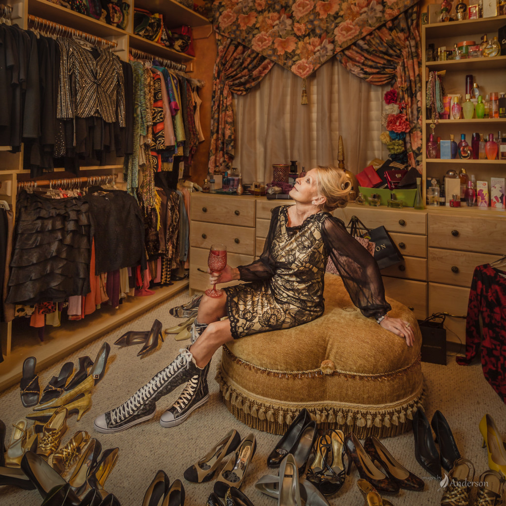
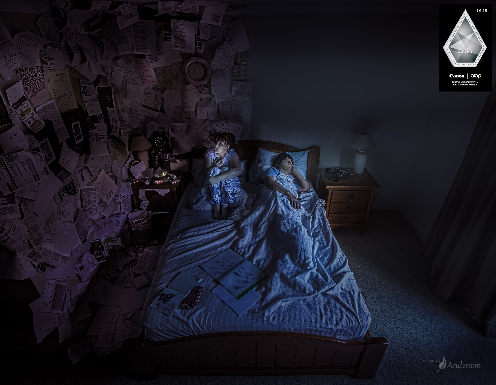
Now… my own images? My category of choice is the Illustrative category, and I’m very proud to be one of the three finalists in that category for this year, along with Charmaine Heyer, and the winner, the extremely talented and most excellent Foroogh Yavari. Same three finalists as last year, so that’s consistency 🙂  All four of my Illustrative images made it over the line, with one of them going up to Gold after an impassioned argument from one of the judges. I’m going to keep most of my images under wraps until the national awards later this year, but one image that I’ll share is this one of my mum Sylvia. I love this portrait of her, photographed in her rather luxurious walk-in closet at home. I had the easy part – Wanda arranged shoes and shelves, and spent the shoot smushed up in the corner of the room holding a gigantic octagonal softbox. 🙂

Blog-1864px-P1501_150111_A5711E2

Sleepless

Finally – the fourth of four prints from the 2015 APPAs – Sleepless. This print is by far the most important to me, because it’s very personal for our family.

Wanda has struggled with anxiety and depression for many years. The first hints of depression showed up not long after our son was born. From then on, it was a bit of a rollercoaster, until the anxiety thing moved in and set up shop. She’s managing it, but it’s always there, and it seems to sneak out and grab her by the leg at the worst possible time.

One of the times Wanda is most vulnerable to it is at night. During the day, there are sights and noises and people to talk to and things to do… At night, you’re alone in the quiet with your thoughts. Nothing to take your attention, nothing to divert you from thinking about everything that might be happening in life. The way Wanda describes it to me, her brain jumps from thing to thing, all of them urgent and all of them important, and when she tries to get away from one of them another one jumps in her way. So she lies awake for ages, thinking about everything and getting more and more caught up in it. One of her defence mechanisms is her phone; playing Bejeweled or Drop 7 or Zuma or another game like that fills her mind and lulls her back to where she can go to sleep… and eventually she does. Meanwhile, I’m sleeping peacefully next to her. I’m a bit of a super sleeper, I can fall asleep mid-sentence sometimes and I

…sorry, nodded off there. Where was I? Yeah, good sleeper. So I sleep through Wanda’s anxiety attacks when she has them. She knows I can’t do anything about them, so she lets me rest.

I wanted to put an image together that told this story. I think this was mostly art therapy; trying to communicate a rich visual representation of Wanda’s state of mind seemed like a good idea. I sketched it out, as I often do. Wanda found the sketch on the iPad and left a little note of her own.

Earlier this year I arrived home (from the Queensland photography conference Hair of the Dog where we talked about art therapy, by coincidence) to find Wanda had decorated our bedroom to match the sketch. She did a pretty masterful job, with pages flowing off of the wall in a chaotic mess. It looked just like the sketch!

Wanda: “Hey, we can shoot this tonight!”

Kris: “Um, no – we need to do it first thing in the morning so I can light it with the morning sun.”

Wanda: “OK. So should we take it down or leave it up? Leave it up I guess?”

That night, I’m pretty sure Wanda sat bolt upright in bed surrounded by papers, while I slept soundly. Life imitating art – even art that hadn’t been created yet.

In the morning, we set up the camera pretty much touching the ceiling and looking down at us, and I photographed it by remote.

Post-production was pretty straightforward, there isn’t a lot there. Everyone assumes the pages are photoshopped on, but can you imagine what a pain that would be? The only significant photoshop tweaking was to shift the pages along the wall just slightly so they were right dead set in the middle. Otherwise lots of edits for colour and feel.

The end product is something I’m really proud of, because it’s our story. I’m glad the judges saw something in it; it’s great that something so personal crept over the line and (after a challenge) scored a Silver at APPA 2015. (Yes! Got a silver medal for a selfie!!)

One really amazing thing about this image is the way people connect with it. Nearly everyone that looks at it can see a bit of their life in there. Maybe they’re the sleepless one, or maybe they see that in their partner. I feel more connected with people after we talk about how the image affects them. What do you see?

Most images are collaborative, often involving a big group of people. I completely owe this image to Wanda, for being the inspiration, for the hard yards in set dressing, for being in it, and for critiquing my edits as it slowly became this print. She has a hand in pretty much everything that we do, and this one was no exception, but I’m honoured that she would entrust me with telling her story.


Generations

Generations is a pretty important print for me, for a bunch of reasons. It’s taken a really long time from conception to closure. I think it’s done now. Here’s the story.

Conception

A few years ago I was thinking about how to tell a story about how music is timeless and important. In my life, music is pretty important; I’ve been a piano player for about as long as I can remember, through all of the highs and lows, three round-the-world relocations, all of my school and uni and single and married and parental life. I thought it would be cool to capture that somehow, and I was thinking through ways of showing a piano and its passage through time.

(Side note: Why do I have to love photographing pianos so much! They’re a massive pain to move! How about a nice guitar, or a harmonica maybe?)

I was working through ideas about seasons, or the evolution of a single place around a piano. Then the idea of a multiple image story popped in to my head, structured around a piano that moves from left to right as time passes. That quickly grew in to a story about the boy that belonged to that piano (or vice versa?) and how he grew up and changed. The story grew by itself, until the main building blocks were there.

I remember driving with Wanda, explaining each of the four panels one by one. When I started on panel number four, she started crying, because she knew exactly what I was going to do. I guess that’s good 🙂 The main impediment at that stage was skill; I was pretty sure I didn’t have the chops to shoot it, light it, and composite it to make it happen. I’d recently worked on a poster for a production called Critical Hit involving similar composite work, but I wasn’t quite ready yet. So I parked it for a couple of years.

Planning

I like to sketch out my ideas first. It helps when there are iPad sketching apps with lovely watercolour brushes that make your work look half decent. (I use Paper by FiftyThree.) So here’s the sketch outlining the general plan.

Execution

Next step – location scouting and casting! The location part was tricky; I couldn’t quite find a location that met the brief. Enter our amazing clients, Aimee and David. We’ve had the privilege of photographing their wedding as well as their ever-growing family on a few occasions. Their house nearly fit the bill. They did most generously allow me to remove all of the furniture from one of their rooms and shoot it from a few angles to get enough to composite it in to a bigger room. And voila, one room.

Now for the casting! Aimee happened to be quite significantly pregnant late last year, and that’s where the casting started. A bunch of people jumped in with both feet, and I am very appreciative of their time and effort! That goes for the piano too. Even the window shades from my parents’ place in Las Vegas made an appearance.

Can I say a massive thanks to everyone that appeared in this project: Aimee, Fiona, Roger, JC, Declan, Aaron, Tara, Gabby, Michael and Rose. You guys completely made this possible.

Shooting was anywhere and everywhere – loungerooms all around Brisbane were turning in to studio spaces for this project.


Speeding it up

Generations got over the line at the Queensland awards with a Silver award, and that was very cool indeed. I did get quite a bit of consistent feedback from judges along the lines of… “AAAAH, Right! I get it now! I didn’t see all of that when I was judging, but NOW I do! Hey that’s great!” which to me is code for “Nice job, but takes too long to read – make it faster!” That advice, plus advice from a few trusted mentors, resulted in a bunch of changes, including losing the girlfriend’s friends (agh sorry guys), reshooting the boy’s older family (c’mon guys, you looked pretty young before), and removing a few elements that cost more in reading time than they gave back in story and understanding, like the text on the boxes, the box on the piano, and so on. The new print felt a lot faster to read – still very full of detail and story, but hopefully something that the judges could see most of in the limited time they have with the print.

APPA!

At the judging, this one scored a solid silver on the first round, with four judges in the mid-80’s, and one judge in the low 90’s. I’m very very happy that the 90’s judge challenged, spoke passionately about the print and what they saw, and on rescore helped a few other judges to move up as well, bringing this up to Gold! A gold award is pretty exciting. I figure it’s going to be a rare, rare feeling to earn one of those. I’ve probably put more work in to this print than any other print in my life, and I’m glad the work was rewarded 🙂

The evolution vids have been getting a good rap, so here’s the evolution of this print… Enjoy!