Relentless

Blog-1864px-A1708_comp8

Relentless is a story about bullying in the digital age, and a reflection of some of our fears as parents.  A challenging personal project, it has changed shape a few times on the way to the final product. It’s scored well at state and national awards, and has really hit home for a few people. Read on for the evolution of the story and the image… Or sit back and watch the video!

The story

Early this year I’d started to realise that Facebook wasn’t as much fun as it used to be; it used to be full of cat videos and pictures of what your cousins had eaten for dinner and other stuff – escapist material. Maybe it’s just the feed I’ve curated, but my feed is full of politics now, and sometimes full of news or ideas that I find really depressing and inconceivable. I’d been hunting for a way to tell that story.

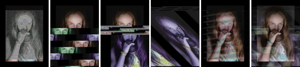
Gee Greenslade is an expert glitcher; she presented a class on glitching at Hair of the Dog in 2017. As much fun as databending and glitch art is, it didn’t seem like there was a sensible way to meld it with my usual photorealistic style of image. …OR WAS THERE… [dun dun DUNNNNN]

1-proto1
The first sketched concept image

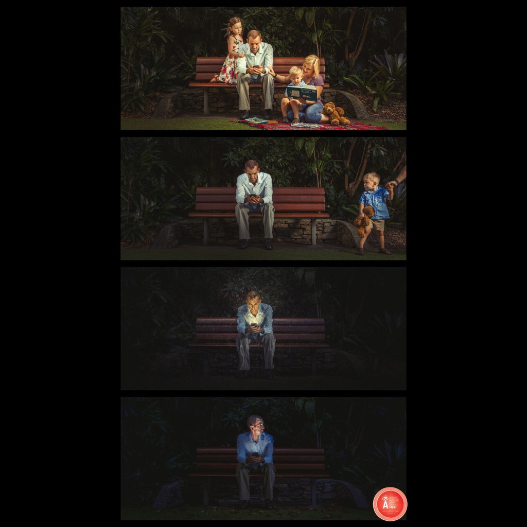
The narrative shifted around a few times over the next few weeks, depending on what sorts of issues were showing up in the news. The increasing volume of alt-right politics, LGBTI rights, intolerance of other cultures/religions/nationalities… all issues that had one societal group ganging up on another… all things that made me a little angry and at times powerless. In the end, the message that rose to the top was much more domestic. It came from realising that our daughter Tara has excellent digital connections with friends, carrying their conversations all over the house with chatting and video calls and Instagram… we’re pretty confident we’ve raised someone that is sensible on-line and won’t allow herself to be bullied… but you never really know. Thinking about that…

1.5-A1708_20170313_A0141E
Shooting the first sketch. Layout doesn’t feel quite right; it will be hard to tell it’s a cage of images because they’ll be overlapping each other.

When I was a kid, I’m pretty sure there were bullies at school. (It was a school, with kids… therefore… bullies.) I’m also sure their reach stopped at school. Home was a safe place away from all that stuff, with your family and your house and your bedroom acting as a sanctuary. You could let your guard down at home, in your own space. Has it changed now? Our kids are masters of online communication, and I’m sure there are still mean kids and bullies around. Do our kids invite them in to their rooms, right past us, via their digital devices? If they do… is there anywhere that is a safe place now, or are they always connected to elements like that? Are we enabling our kids to bring bullies and peer pressure right in to their rooms?

2.1-A1708_20170315_A0162EE
New prototype from a new perspective – this is much better!

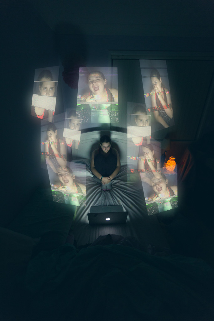
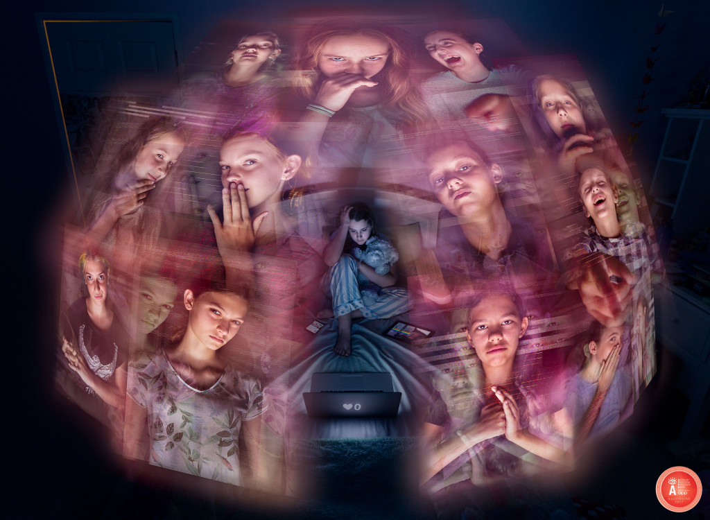
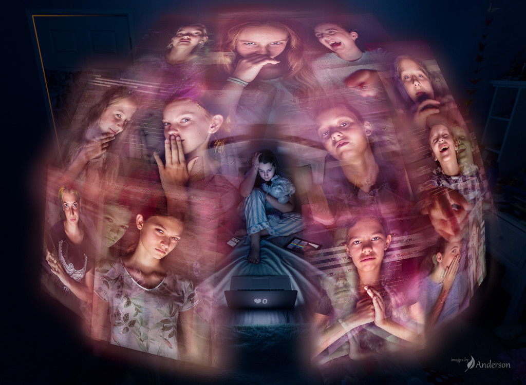
This image came out of that. One young girl, in her room, surrounded by a digital cage of bullies.

The mean girls and glitching

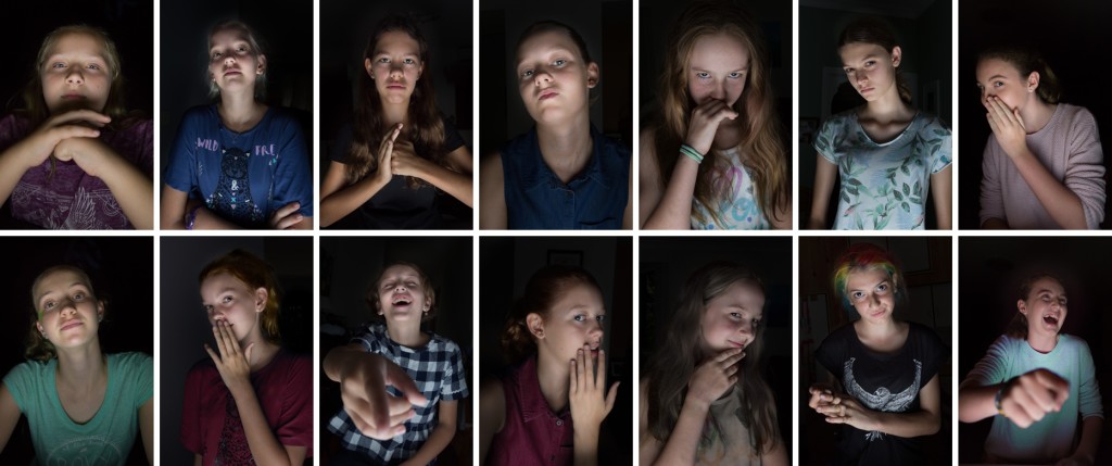
Tara and I photographed a mix of her friends, family friends, and local actor contacts playing the part of mean girls. (It would have been totally valid to have a mix of girls and boys, but the story seemed more pointed with just girls.) Pointing and laughing, whispering, looking superior and looking down on the viewer… all lit from below, as if they’re sitting at their computer. Light from below is naturally pretty spooky, so that would help to drive home the discomfort looking at these images. (Is it developmentally scarring having Tara come with and assist on all of those shoots, getting her friends and some others to act like they hate her? I hope not!)

In reality, these girls are so far from the Mean Girl image it’s not funny – they’re all sweet and smiles. A few of them identified bullying as an issue close to their hearts too, so they were keen to take part. Thanks girls, you were all excellent actors. 🙂

2017-10-18_0001

Glitching these images was a lot of fun. Lots of random images, lots of failures, lots of files corrupted past the point anything would open them… but for each of the girls, a set of great source glitched images to work from. The more I did, the better I got at aiming the glitch at part of the picture (like the eyes), and the more luck I had with predicting the output. Rather than just stacking all of the glitched images together, they were layered so the primary image was still strong, and the glitches complimented rather than clobbered the face.

2017-10-18_0003

Putting it all together

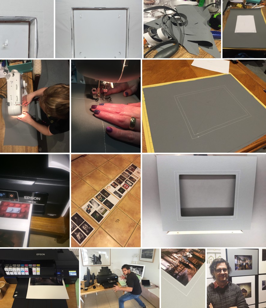
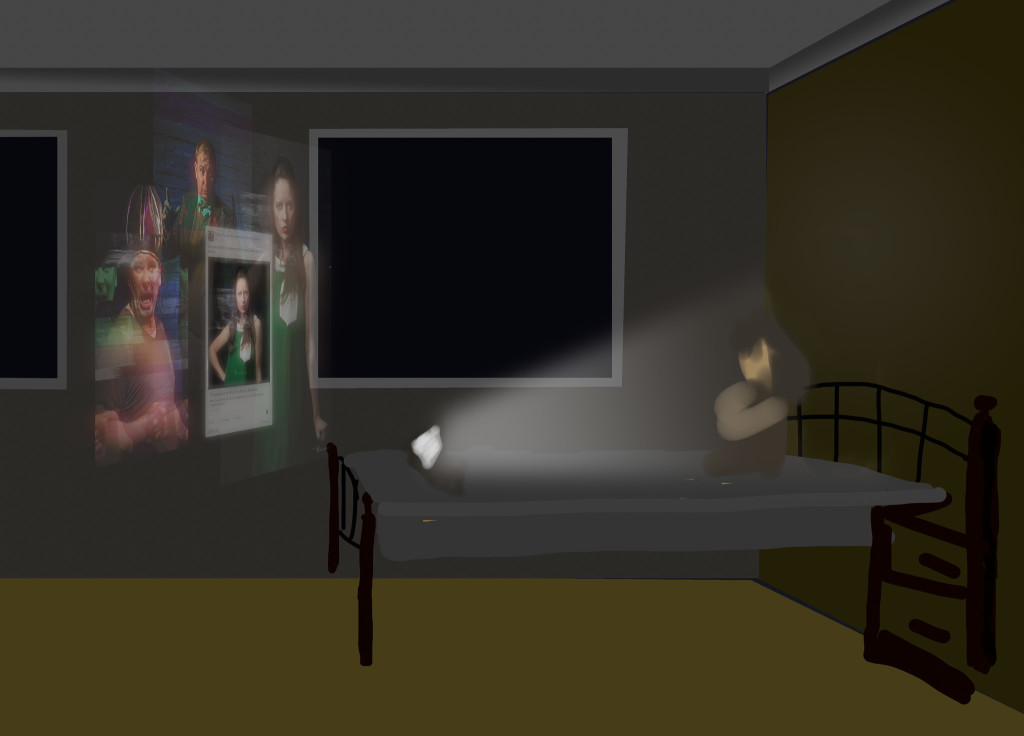
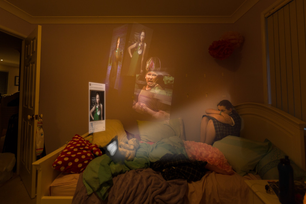
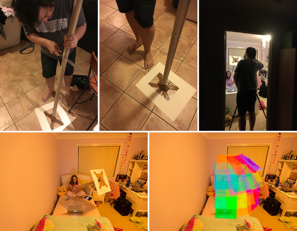
There were really only a few elements in this image, and no really complex masking – the floating frames were supposed to look like they didn’t belong there, so they weren’t tightly integrated in to the rest of the shot. To get the look of that cage of images right, we used a very, very high tech tool to get the geometry of the different panels right. Then dropping them in and getting the right amount of opacity and floating look was the trick.

2017-10-18_0004

It was important that the viewer understands that these are screens – the portrait orientation, the digital-looking glitching, and the variety of devices scattered around the main subject should be hopefully enough to get that across.

Blog-1864px-A1708_comp5

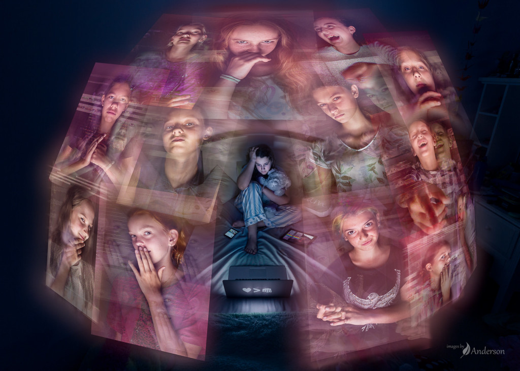
Once it all came together, there were a few little changes to make it stronger. Changing the motif on the laptop from a “love beats hate” motif to a “you’ve got no Likes” motif helped put the subject in to more of a downward spiral. Some of the faces moved around until it had the optimal balance of faces looking at each other, at the subject, etc. That top left portion of the image was suspiciously blank as well, which might have made logical or visual sense, but was confusingly blank. I’m glad that space needed filling; having a door there, with light peeking through the edges of the door, was intended to show that the rest of the house and the rest of the family might have been warm and bright and happy, but she was cut off from all of that… and the bullies had snuck in right under the rest of the family’s noses.

Blog-1864px-A1708_comp8

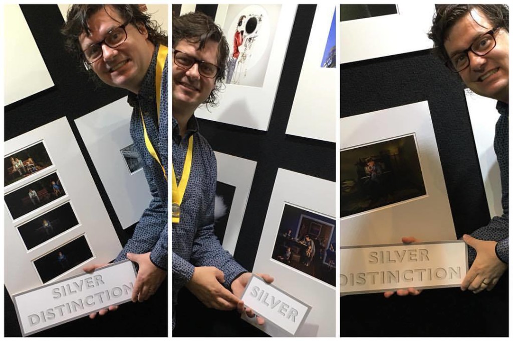
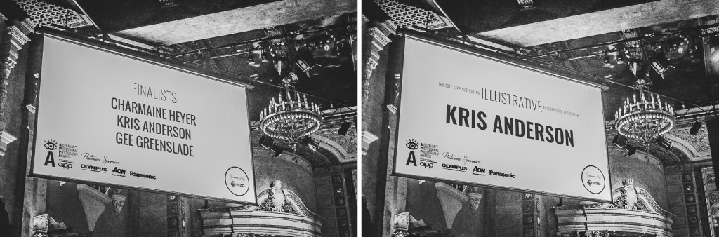
I’m pleased to say this image scored a Silver at the Queensland Professional Photography Awards, and a Silver with Distinction at the Australian Professional Photography Awards. I’m also proud that it is in the portfolio that earned both the Queensland and Australian Illustrative Photographer of the Year for 2017 – thanks Eizo for making th category possible!

Thank you to Shane and to the 1-2 punch of Epson printers and Canson papers for helping the print be all it can be.

A huge thank you to the girls that participated in this image… especially Tara, who either assisted or was the subject for every shoot in this image. I was very proud to dedicate the Queensland Illustrative PPY award to her.


2017 Australian Illustrative Photographer of the Year

We’ve just returned from Melbourne, where we were lucky enough to have a week of seeing friends, watching the APPA judging, and attending some crazy fun events. The name of the game is the Australian Professional Photography Awards. Run every year by the AIPP, the APPAs are a chance for professional (and emerging and student) photographers from around the country to submit their best work to be judged by the cream of the crop. This was my fourth APPAs entering as an Accredited Professional Photographer, with one before that as an Emerging Photographer.

As great as the judging is, it isn’t the only reason to head down. The gallery of awarded prints is stupendous, and worth visiting just to look at the huge variety of amazing work people are doing. Personally I love getting to see everyone, catch up and renew friendships, muck about, and generally recharge the relationships with our APPA family.

David Simmonds Photographer: Sponsor Fun Wall &emdash; APPA dinner 2017-3532
Half the fun is staying with a fun bunch of people. Had a great time AirBnB’ing with these funsters!

For 2017, I had four prints in the Illustrative category, three that have had a run at the state awards, and one new one. The goal: To earn three points (by getting at least three Silvers), and qualify for my Master of Photography. I’m not always goal-oriented, but after the APPAs in 2014, some new goals were made: Associate in 2015, and Master in 2017.

Three stellar outcomes from the 2017 APPAs:

Four awards from four entries. Very happy that all four entries got over the line, in what felt like pretty tough-but-fair judging. One Silver and three Silver Distinctions for these prints! One of my prints (Restless) was the first print up for the day, which is always a tough spot.

21125396_1567507963270820_6028798360597362040_o
Never did find Relentless on the wall. Oh well.

Master of Photography. At the awards dinner, having earned my three points and then some, super happy to convert my yellow Associates ribbon to a red Masters ribbon.

Illustrative category… I have to admit that I didn’t really think I had a shot at being a finalist. To work out the three finalists, they take the aggregate score from your four images, and pick out the three entrants in each category with the highest aggregate score to be the finalists. Then they throw those scores away, and a panel of judges look through the three portfolios of four images each to choose the category winner. One Silver and three SDs isn’t anything to sneeze at, but it felt a little far away from finalist status.

Finalist?!?!? Surprise level x 100

WINNER?!?!?!? Surprise level x 1 bazillion

Blog-1864px-2017-09-03_0001
Finalist?!? WINNER?!? Thanks Andre Agnew for capturing this.

I need to stop and explain something for a minute. The APPAs showcase the absolute best work from the absolute best photographers in the country. New people appear, some names disappear, but the work is always stellar and the standard just gets higher and higher each year. When you see this work, and you see the technical quality, the storytelling ability, the innovation of the best of the best, it really gives you something to aspire to, so that one day you might find yourself a finalist in a category. That’s a massive aspirational goal; I thought maybe I had a shot at finalist after a decade of work under my belt.

Not only that… Those two names on the board there with me? Charmaine Heyer and Gee Greenslade? They’re both incredible artists, innovative and fresh and flawless and clever. I’ve spent time staring at their images to figure out where their brain was at when they made it and how they did the things. And they’re both really decent people to boot. I’ve idolised Charmaine’s work since I started my APPA journey. When I first saw Gee’s work it blew me away; I made it my mission to seek her out and meet her, and since then I’m very proud to call Gee a friend. So – to have my name in that list with them is massive.

Winning a category is just unreal. Unreal.

Blog-1864px-DSCF0188

Blog-1864px-DSCF0191
Andre Agnew captured these two great images, the smoochy one right after the announcement, and the second during my speech. The second one, where Wanda was beside herself with nervcitement with our close friends and APPA buddies Sara McKenna and Colleen Harris is maybe one of my favourite photographs ever.
David Simmonds Photographer: AWARDS &emdash; SIMMONDS_APPA_Gala Event-2017-5892
Filipe Rojas from EIZO, and Vittorio Natoli (AIPP National President) handing over the loot. And it was good loot, too.
David Simmonds Photographer: AWARDS &emdash; SIMMONDS_APPA_Gala Event-2017-5904
You know me, love the microphone and the spotlight! Hahahaha no. Thank you David Simmons for the excellent event photography.

Congratulations to all the category winners, including Doco legend and stage buddy Kelly Champion, HotD compatriot Katie Kolenberg, Queen of pet photography Angie Connell, my new friend Mick Porter (who I finally met on stage after messaging a few times), wedding genius James Simmons, and especially Keren Dobia who won overall Professional Photographer of the Year. All ace humans. You can view the category winners and all of the awarded prints online, and it’s worth a visit if you are a lover of fine photography.

21167371_10156500290343362_110515655115057682_o
Category Finalists! Charmaine Heyer, me, and Gee Greenslade. These two are hugely inspiring to me.

You can’t have a blog post like this without a bunch of thank-you’s. Here they are. Make sure you read them because the people in this list are awesome and deserve a moment of your time 🙂

A whole bunch of people contributed to these prints – subjects, assistants, people that provided furniture/locations. There are pieces of each of them in these prints; everyone pushes it around a little bit, and they wouldn’t be what they are without that help. (Mucho blog entries coming up for each image where I’ll go on about these people and their awesomeness in some detail.)

Same goes for the mad crew of photographers that help me to check the work and make sure it is as solid and strong as it can be. If you are a photographer and don’t have your own rock-throwing crew, you’ve gotta get one.

Our good friend Shane McCaffery of Shane McCaffery Portraits printed these images. I’ve trusted Epson printers and Canson papers forever, and they continued to deliver.

To EIZO and Penny and Filipe – thank you for sponsoring the Illustrative category. Illustrative work is a Big Deal for a bunch of us, and I’m thankful that your support helps to keep this category very much alive and well, and letting us do what we do. EIZO had a hand in these images as well, particularly Senseless, where I was able to really understand the shadow detail and the highlights and how they would be printed; it greatly reduced the edit-print-adjust cycle and helped me to ensure the work made it to paper the way I wanted it to.

To our AIPP family – the Queenslanders and all the interstate folks that have become solid friends. You lot are all right. I’ve felt like I’ve been accepted in to a great community since day one. It’s nice to feel like you’ve found your tribe.

Last and most importantly, my family. Making personal work like this isn’t possible without a good support network, and you guys are hands down the best. Wanda, Bailey, Tara, thank you for always being there and always making me feel supported. Wanda makes stuff and throws ideas around and helps me to tune these images to make them strong. I love you Wanda – thank you for being my partner in everything. Special thank you to Tara, who tirelessly assisted for these images, everything from holding lights to being a subject. Tara’s shot with me a couple of times and it’s amazing to see her take an interest in this stuff too.

Thank you to Mum & Dad as well, I owe you more than you could possibly ever know. Mum, this is for you. <3

A1621_APPA_COMPA1708_comp8A1709_V4E-2EA1715_Comp_02-Assembled


Aus Illustrative 2017 Square v2

Print Handlers

After six months of doing the print competition thing, finally time to finish this entry about Print Handlers, with some extra behind-the-scenes goodness. (Guilty secret, we’ve published this before, but the story has changed now, so lets pretend it’s a brand new post. Ssshhh.)

41-A1520_Composite_Combined_WPPIE

A few years ago at the Queensland state awards dinner, Simon Hutchen introduced himself, and talked about how he was really excited for one of my prints. He’d been on duty behind the scenes as a print handler, taking prints off the stack, making sure they were in top condition before putting them up for judging. He spoke about carefully checking and dusting my print, and other prints, and we got to talking about all of the aspects of working as a print handler. He spoke about the whole thing with so much respect, respect for the work, respect for the photographers, and a love for just being a part of the process.

Of course, he isn’t the only one to feel that way. I think anyone involved in the awards knows people who have worked back there, and I’m willing to bet that they all sing the same tune. All my other friends that have had roles to play behind the curtain speak in much the same way. Opening a case of prints and being the first to see incredible work, prepping prints for judging, taking awarded prints and putting them up for display… They all talk about the process with that same sense of excitement and respect.

Now, as an observer of the judging for print awards, you never get to see any of that. That all happens behind the wall, and prints magically appear and disappear in the right order like clockwork. I wanted to fashion an image that gave a little peek in to what is going on behind the scenes… Something fantastic, something that conveyed that reverence for the work.

To me, this print is about respect – respect for the work of photographers, and respect for the people that take care of the images. In the finished piece, every print here is special; there are no stacks of prints, they each wait patiently until someone comes to take them for judging. It is an Event for the print handlers – t-shirts, jeans and regular photo-handling gloves replaced with glamorous black-tie dresses and suits with opera gloves. Something special and something to be celebrated.

The Print Handlers

So… preparing a print like this for the awards is interesting. Part of the appeal of this print has to be the impact it has on judges who aren’t really prepared for it, so it’s important to keep it under wraps. After identifying photographers that had actually done print handling, and weren’t too notorious, my pitch was something like… “Hi there! So… would you like to be part of a project? You can’t tell anyone about it, not even to say that I’m photographing you. And I’m not going to tell you what the project is yet. Are you in?” Had a 100% “YES!” rate, which is terribly cool. We ended up shooting these people-parts in our lounge at home, at a few studios (Studio Fascino at the Gold Coast and the Garage Studio in Sunbury), and even in other people’s lounge rooms (thanks Greg!).

The location was a happy accident. Wanda and I were travelling in mid-2015, and one of the shots I took in Sweden seemed to be a good fit. You can check the whole room out in a groovy 360-degree virtual tour (where the photographer stood in a much better spot than I did, dangit).

blog-1864px-photo-29-10-2015-10-31-38-pm
Sketches are great for knocking out heaps of the complexity with constructed images like this. Better to throw away a few designs now, instead of later after you’ve shot.
PH-guidelines
Guidelines showing the easel height at metre intervals.


Colleen was my test subject and the first one to be shot. You might notice she has a red lanyard in the image below – I had an authentic lanyard from an APPA 2015 print handler to use as a prop. Unfortunately, not long after that, the APPAs had a sponsorship change, so my carefully procured red lanyard made way for a standard AIPP lanyard. (At the actual 2016 APPA judging, it was the Nikon AIPP lanyard with yellow squares every now and again. Sigh, can’t win em all.)

How’s this for super committed? I realised one evening that I had a few hours to kill in Melbourne the following day before flying home. I gave Fiona Handbury a call. “Hey, do you want to be in an APPA image? You have to organise a black dress, hair, a lanyard, white opera gloves, a print and a print case… and a studio.” One hour later, Fi says “Done. See you tomorrow.”

Tristam Evison has printed many many APPA-awarded prints, and a great many of mine, so it was quite a pleasure to get to include him in a print. “You’ve worked behind the scenes at QPPA, right?” “Yeah, but mostly delivering coffee.” BAM.

2016-09-21_0002
The ten awesome subjects in the print – all of whom have worked behind the scenes. Top row: Colleen Harris, Megan Rizzo, Simon Hutchen, Alycia Angel, Ralph Brown Bottom row: Tristam Evison, Sue Lewis, Roxanne Gorman, Greg Hanlon, Fiona Handbury

2016-09-22_0003
Behind the Scenes at Studio Fascino. Thanks for the photos Megan Rizzo!


See Simon in there, with the blower, making sure that print is nice and tidy and ready for judging? That’s the exact print he was telling me about when I first met him, the one he was really excited to prepare. That seemed fitting.

[twenty20 img1=”4424″ img2=”4425″ width=”40%” offset=”0.5″]


The Prints

One of the fun easter eggs for me in this print is the selection of images playing the part of APPA prints – each one of them printed and re-photographed as an award print, prints that could conceivably fall in to categories like Travel, Landscape, Portrait, or Illustrative. (None of these images have ever been in the awards, although I’ve shortlisted a couple of them have been shortlisted when preparing award submissions in the past.) There are photographs of my gorgeous wife Wanda, our son, my Dad, plus some of our amazing theatre clients including ImproMafia, The Sexy Detectives and BangNation, one of our wedding couples Caitie and Luke, and some other personal work including a smoke-painting-shoutout to Kelly Gerdes. And a sunrise shot from a Landscape Masterclass in Victoria where we met a bunch of pretty legendary photographers that have become good friends. (Does this mean these 13 prints have also scored awards at a state, national and international level? I think yes!! 😀 )

2016-09-21_0001

[twenty20 img1=”4394″ img2=”4406″ width=”75%” offset=”0.5″]

Judging volume 1 – The Mat. Sigh.

Ever have a good idea that turned out to be not so great?

For the 2016 APPA print, I acquired some of the material that was used to create the judging wall – offcuts from the exact batch that the judging walls are made of – and used that instead of a traditional mat. The fabric and the stitching pretty much exactly matches the rest of the wall. For the few minutes that the print was on the wall, it was intended to be a sneaky look in to what was going on behind the scenes at that exact moment. I was pretty taken with the idea that the print would be contextually correct for just a few moments, a little window in to that back room, PART of that wall instead of a print sitting on the wall. Surely that whole convention-breaking thing would be celebrated by the judges! Surely!!

Um, no. Just. No.

That was a risk that did not pay off. Pretty sure the unusual mat was the least appealing part of the print for the judges. It was distracting, and made it harder to connect with the image; it’s hard enough to clear your mind between one print and the next, without having this distracting mat poking you in the eye while you’re trying to read the print. I don’t think anyone tumbled to the idea that the stitching or the material was the same – I think it’s probably normal to judge a thousand prints and have never really looked at the judging wall! But – that’s what taking risks is about, so it’s all good.

Huge thanks to Tristam and Wanda for the mat help. They both went WAY above and beyond to make this thing work. If either of you want to punch me in the shoulder and tell me to mat things normally next time, go for it.

2016-09-25_0001

Also – can I complain about the score? No I cannot! The print scored an 87, squarely in Silver with Distinction range. Not too shabby.

Judging volume II – Vegas, Baby

This print had a run at the WPPI 16×20 awards in Las Vegas. One notable improvement – no crazy mat. Too late I realised that I’d kind of botched some colour around the window, but time had gotten away from me, so the print went in as it was, and it came home with an 83, Silver Award. Nothing to sneeze at.

Judging volume III – Back to Brisbane

This print started life in Brisbane, and for the very last time we are able to take prints that have been to APPA and give them a run in the state awards. So – no crazy mat, colour issues fixed, feedback from the judges at both APPA and WPPI actioned, and an intense edit-print-examine-curse-edit-print-examine-curse-repeat cycle later – super excited to watch the print score a 90, Gold Award, at the Queensland awards, and also become part of the Illustrative Photographer of the Year portfolio!

One of the best bits? It is understandable that this image can look like a bit of a piss take on the awards, but the intent is anything but – it’s supposed to be about respect. Hearing Kaye Davis from New Zealand challenging and talking this print up as a something of a timeless tribute to photography was just excellent.

Thank you’s

I think most of my APPA prints are a team effort, and this one more than any other. Thank you to my amazing wife and partner in crime Wanda for being super supportive, and for being extra patient with me when stitching the crazy mat. (And for not divorcing me after my back-seat-driving while she was sewing. “Too close! Wait too far! Too spaced out! Too neat! Too messy!”), Dan for the material, Tristam for the matting (yes it STILL smells, Tristam) and APPA+WPPI printing, and Shane for the QEPPA printing. And to my a+ assistant Tara who is always super keen to be part of these projects, despite my hassling her all the time to clean her room.

Massive thank you to the photographers that very enthusiastically signed up to be part of this image – Simon Hutchen, Alycia Angel, Fiona Handbury, Colleen Harris, Roxanne Gorman, Greg Hanlon, Ralph Brown, Tristam Evison, Megan Rizzo and Sue Lewis. All of these guys have actually done this job, working behind the scenes at state or national awards. You guys put a lot of trust in me, and I hope this print is something you will value for a long time.